Email Development
5 Easy Tips for Mobile Optimization

With mobile opens on the rise, responsive design is more important than ever. And while a good responsive template can take your email marketing to the next level, most don’t contain elements to ensure your email really shines on mobile devices. But with a minimal amount of effort, you can make your campaigns more effective and enjoyable for mobile users.
Here are five ways to polish the template or email you’ve built or purchased:
1. Keep your layout simple
Email is most effective when you can keep your message and format simple. By reducing the amount of clutter and extra content in your email, you draw attention to what you really want recipients to read or do. The first thing to make sure of is that you have a single column design. Using a single column will help your email to fit the screens of smaller mobile devices well, and it also allows you to draw the reader through your content in a linear fashion.
For some content blocks, a two-column design can also work on mobile, but I wouldn’t recommend going beyond two columns. Content will become cramped and hard to read. The code for this should already be built into your template. If it’s not, look for a template that slims down to one column on mobile and start from there. We have a few templates that you can use for free:
Another good trick to keep in your tool belt is hiding content on mobile. This can be especially useful for content that links to a page that’s not mobile friendly. If it’s not the main objective of the email, you may want to just hide it from mobile users. This can really improve your click-through rate on your main CTA, by just giving mobile users less options.
                                @media only screen and (max-device-width: 320px){
  .hidden {display: none !important;}
  }
Using the previous two techniques, try to put the most important content at the top of your email. This will help you stay above the fold and increase your odds of getting clicks. In terms of email, the “fold” is the limit of what can be seen on the screen when the email loads without any scrolling. One important rule: Make sure that your primary CTA is above the fold! You’d be surprised by how much this will increase your click throughs, and for emails where click throughs and conversions are the primary goal, this is especially important. If necessary, you can use the “display:none” trick to get rid of unnecessary navigation elements and other content so that your CTA and most important content are above the fold.
2. Resize images and text for mobile users
If recipients can’t read your email, it’s not likely to convert them. That’s why you need to make sure that all of your text is legible, no matter the device it appears on. The best way to do this is by applying classes to your titles, headings and body text. You can use these classes to resize text on a case-by-case basis. Once you’ve applied the classes, test your email on an iPhone and Android to make sure that your font size displays well.
Apple recommends a default of 17px font for body text, and an absolute minimum of 11px. Android recommends a default of 16px font for body text, and an absolute minimum of 12px. You should keep your body font size at 16 or 17px to appease these requirements, and smaller text (captions or footer text) should be at least 12px.
Your code snippet to apply this fix would look something like the following:
                                <style type="text/css">
.title {font-size: 20px;}
.heading {font-size: 16px;}
.body_text {font-size: 12px;}
.small_text {font-size: 9px;}
 @media only screen and (max-width: 479px) {
  .title {font-size: 24px !important;}
  .heading {font-size: 20px !important;}
  .body_text {font-size: 17px !important;}
  .small_text {font-size: 12px !important;}
  }
</style>
You’ll also want to resize some of your images–usually the images that should become the full width of the email–to make sure that they fit mobile screens. To do this, you’ll need to apply a class to the images that you want to display at full width.
An example of this type of fix:
                                <style type="text/css">
 @media only screen and (max-width: 479px) {
  .full_width {width: 100% !important;}
  }
</style>
<body>
  <img src="www.example.com" class="full_width" width="140px" />
</body>
You can use the same technique to make images smaller on mobile devices, if you don’t want to break the flow of the text with a full-width image. Just change your style to any width you choose.
While you are resizing your text, it’s important to make sure that your call to action buttons are easy to see and easy to touch. You might want to resize the text on the button using the above technique. For touchability, it’s important that the whole button actually be linked and not just the button’s text. If a recipient touches the edge of your colored button, they should be able to follow the link. To accomplish this, make sure that your link (anchor tag) is either wrapped around an image or has the correct size and width. If the colored background of your button comes from a table around the link, only the text will be clickable. If the button is a CTA, I would recommend that it take up about 80% of the screen width on mobile devices. This ensures that it will have strong visual presence and draw the reader’s eye.
But don’t stop there! The links in your header and footer will often become cramped on mobile. Make sure that they are large enough to touch easily. Apple recommends that buttons be at least 44×44 pixels, while Android recommends 48×48. If your template has a “login” button in the header, and your site is mobile friendly, don’t forget to give this some special attention.
Having trouble finding a good button? Try our most recent bulletproof button.
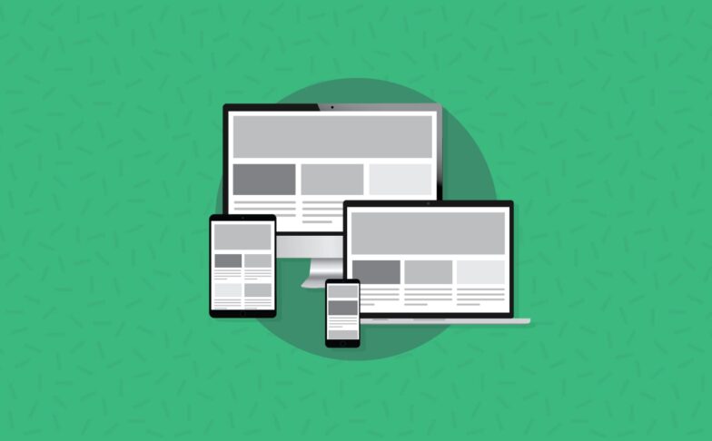
4. Optimize for multiple screen sizes
Until the iPhone 6 and 6+ came out, most email templates only came in 3 sizes: desktop, web and mobile. Despite the fact that Android phones came in a huge variety of screen sizes, most Android users were forced to make do with media queries designed for the iPhone 5. More recently, however, it has become important to have a size between phones and tablets, sometimes called “phablet.”
By adding a few styles to target the iPhone 6, 6+ and anything else in this “phablet” size, you can make your email look a lot better on these devices. A 320px wide layout on a 414px wide iPhone 6+ (yes, the iPhone 6+ is 1080px wide, but because of pixel density the “actual” width of the display is 414px) leaves 47px of empty space on either side of the main content. That’s too much of a “gutter” for most emails to look good.
You can address this by adding a few more media queries to your embedded styles:
                                @media only screen and (max-device-width: 640px){
  .container {width: 440px !important;}
  }
@media only screen and (max-device-width: 414px) {
  .container {width: 380px !important;}
  }
@media only screen and (max-device-width: 375px) {
  .container {width: 350px !important;}
  }
@media only screen and (max-device-width: 320px){
  .container {width: 280px !important;}
  }
Feel free to tweak these settings depending on your content and how much of a gutter you’d like along the left and right of your email.
On the other hand, you may want to embrace fluid hybrid design instead. Fluid hybrid design enables email developers to create emails that expand to fit almost any device, even in the Gmail app! To learn more about this technique, read our primer or get started with our free, fluid hybrid Coffee Shop template.
5. Create mobile friendly landing pages
By utilizing the previous tips, you’ve done everything right to woo your mobile readers. Now’s the time to close the deal. If your readers click your carefully crafted CTA only to find themselves on a huge, unresponsive webpage, they’ll start dropping off like flies. Nothing is more frustrating than deciding to make a purchase and then having difficulty finalizing the process.
Eliminate these roadblocks by making sure that your landing page is mobile optimized to complete the conversion process. Or, if you’re taking readers to a content page, make sure the content is well formatted for mobile devices and that the text size is readable. Sound familiar?
Test the landing page as part of your production process to ensure a seamless customer experience. If the text is too small, the form is hard to fill out, or the CTA is hard to click, your landing page needs some work!
Try these techniques and watch your mobile click-through rate soar.
Test your email today!
Want to make sure your email is looking like a million bucks on mobile devices? Get started with testing today!