Tips for Email UX and Design Best Practices
I only have 50 milliseconds to grab your attention.
The same holds true when you go to capture a user’s attention in an email.
User experience (UX) is important, and while there is ample content out there for anyone interested in learning more about web UX, there seems to be less when it comes to email marketing UX.
Email UX is often forgotten, ignored, or treated like the red-headed stepchild (no offense, redheads). Poorly designed emails can lead to fewer conversions, lost revenue, and erosion of brand trust. After a lot of reading and research, I’ve compiled my best advice for good UX in emails. While I won’t be getting into email accessibility, I’ll be exploring how to create the best UX for your email subscribers, focusing on the email content instead of the whole subscriber journey.

Email UX is about keeping the email as simple and honest as possible. What do I mean by simple? It doesn’t include any extra information, images, or text than it needs in order to achieve its goal (usually with a single click). What about honesty? The content in the email isn’t fake, disingenuous, or a bait and switch.
The most successful emails make it easy for the user to consume and act upon your content.
Most emails have a handful of elements that work together to achieve a click. If one element is out of place, it can impact all the work you’ve put into the other elements and can dilute your chances for a click or conversion.
Table of content
Important Elements of an Email Campaign
Inbox Details
This is your chance at a killer first impression to get the reader to open your email. It includes the subject line, preheader text, sender address, sender name, and reply-to address.
Don’t look like a spammer.
—Matt Vernhout, quoting Unknown
Start with your company’s name as the sender and use a monitored email for your reply-to address. Trust is built when your reader quickly knows who the email is from and what to expect from the content. There’s a potential to test different senders if that aligns with your branding guidelines, but the goal is on-sight recognition and readability. Plus, including a monitored reply-to email address completes the feedback loop.
Your subject line should answer the question, “Why should I open this email?” Keep it as short and to-the-point as possible. Crafting the perfect subject line and preheader text may seem daunting, but it’s very possible.
Content
Better known as everything your email contains.
“When you emphasize everything, you emphasize nothing”
—Herschell Gordon Lewis, Effective Email Marketing
You have 11 seconds, at most, to communicate your message. Writing clearly and succinctly is difficult and is not given the respect it deserves, especially in email. This is a lengthy topic, but I’m going to touch on a few elements to improve the UX of your content.
Let’s start with the assumption that your subscribers will only scan your email. Make it easy for them.
- Start with the bare minimum of copy that you need to get your point across. Unless your email newsletter is an eBook (which, we recommend linking to instead), limit the number of words.
- The optimal line length for body copy is 50-80 characters.
- Don’t waste your reader’s time. Get to the point by communicating value.
- Emails should have specific goals (preferably just one goal, or maybe two). If you can’t answer the question, “Why am I sending this email?” then you should not be sending it,
- If conversion is the goal of your email (click, purchase, registration, download, etc.), pay close attention to your value proposition. Answer the question, “Why should they click through?” If your value proposition is solid, the subscriber will say, “If I click, I’m going to get something out of it.”
“The average adult reader can read 250 to 300 words per minute. If the average reading time for an email is 11 seconds, then the ideal length of an email is around 50 words.”
—Tom Tate, AWeber
I want to talk briefly about cognitive load, which is the amount of mental resources required to operate a system. According to the Nielsen Norman Group, minimizing cognitive load maximizes usability because humans have limited processing power.
When the amount of incoming information exceeds our ability to handle it, performance suffers. We may take longer to understand the information, miss important details, or even get overwhelmed and abandon the task. Cognitive load is the science behind why it’s important to trim your content, chunk it, and use a content hierarchy (more on that below).
Design
Design elements down to color selection and image choice are not to be overlooked when creating your email.
How does your email look and behave, and how will your subscribers interact with your email?
“Great design is eliminating all unnecessary details”
—Minh D. Tran, technologist and designer
“Visual design is the mechanism through which we interact with subscribers.”
—Jason Rodriguez
Let’s review a few key design elements and how to optimize each for the best email UX.
Colors
Contrast is the name of the game.
Using colors that don’t have enough contrast makes your email difficult to read. Consider colorblindness when choosing your palette, as well as using colors that have ample contrast, meaning there’s a big difference between one color and another—like a black background and white text.
Good example of high contrast from Land's End:

Bad example of distracting design and poor color choice:

Images
These can be still photos, animated gifs, icons, and more.
Avoid large files and long load times. Email file size should be below 100KB. Image sizes should be less than 1MB. Maintain your image crispness on retina devices by using 2x image width while keeping the file sizes small.
If you use background images with HTML text overlay, make sure your image isn’t busy or distracting. If it is, try using a background color with live text instead. Remember to use contrast to draw attention to your message.
Users expect to click on graphics to be redirected, so don’t forget to link every image, gif, icon, etc. in your email. Gmail adds a download button to images larger than 200x200px if they’re not linked, so it’s always best to link.
According to the Picture Superiority Effect, images are remembered better than words. Use images that complement your email’s message and don’t distract from the goal.
Remember that many subscribers have images blocked by default, so including descriptive alt text for them and your visually-impaired audience who use screen readers is essential to accessible email UX.
Typography = readability
If people can’t read your words, why bother using them?
Use bold, italic and varying font weights and sizes to illustrate hierarchy and contrast. Use fonts that are readable and email client safe, such as Georgia, Arial, Times New Roman and Verdana.
When possible, bullet lists. They make content easier to skim, but be sure to limit it to three to five bullet points. Paragraphs should be five lines or fewer. As a rule of thumb, paragraphs longer than three lines should be left-aligned, not centered.
Don’t be afraid of white space. Use padding, especially between headlines, subheadlines, and body text.
Font size is also important. Small text on a desktop client is very small on mobile, which is why you need to adjust your fonts for those subscribers. On desktop, the recommended minimum is 16px for body text, and a maximum of 21px. Pay close attention to line-height; depending on how much text you have, you may need to adjust it.
If possible, always underline links and avoid clustering links, as they can be difficult to click (especially on mobile). Make your links stand out for easy access!
Content Hierarchy
Highlighting the most important point of your message
- Your headline should be your largest text, don’t be afraid to go bold.
- Subheadlines should be smaller than headlines.
- Break up your body copy into chunks: short paragraphs, bulleted lists, and white space are your friends! Nobody wants to (or will) read a wall of text.
- End your email with a call-to-action (CTA). More on that below.
PostMates delivers good content hierarchy:

Deciem delivers good contrast and hierarchy:
Overall Design Strategy
Subscribers on mobile are limited by screen size. According to the experts at ActionRocket, your job as an email marketer is to make the act of scrolling easy and attractive. This can be achieved by employing good design and proper distribution of content.
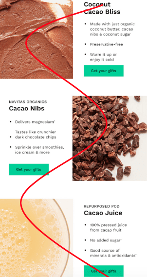
Using visual cues that guide the reader to scroll through your email, such as diagonal lines, screen-size chunks, and the S-curve layout is one way to keep readers engaged. The S-curve approach includes a two-column layout with an image on one side and copy on the other, switching sides with each subsequent row. Check out this example of an S-curve layout from BBC, courtesy of ActionRocket.
To figure out what elements stand out most in your email, do the “squint test.”
What do you see when you squint at your email? Obviously not much, but the elements that stand out the most (even while blurry) are the prominent pieces your subscribers will see.
Example of an S-curve layout from Thrive Market:
CTA
Use a CTA to tell the reader what action you want them to take. CTAs don’t have to be buttons, but they tend to be buttons. They can encourage digital actions (click, read, buy online), drive readers to a digital property, or take an action offline. For our purposes, since we mostly see buttons and text link CTAs in email, that’s what we’ll talk about here.
Hick’s Law stipulates, “the time it takes to make a decision increases with the number and complexity of choices.” This is why email marketers don’t typically include multiple primary CTAs in one email. There are a few exceptions, such as long-form newsletters.
Your CTA design is a visual cue, so make them easy to click across devices. The size should be a minimum of 44x44px and your button should stand out from the rest of the content. Use a contrasting color (on-brand, of course) and use a filled-in button for primary CTAs. Ghost buttons or text links are fine for secondary CTAs, but in my experience don’t perform as well as regular filled-in buttons (maybe they don’t pass the squint test).
If you have your email metrics handy, closely monitor them to see which CTAs your subscribers engaging with most.
Use live text whenever possible and always use a bulletproof button (an HTML button that works in all email clients). That way, if your subscribers have image blocking, they will still see your CTA.
As for placement, CTAs tend to be somewhere below some of your explanatory messaging. People won’t take action if they don’t know what they’re getting out of it. The simpler your message is, the more acceptable it is to have your CTA toward the top.
Example of a filled-in CTA button with contrasting colors from REI:

Overall Email Experience
When possible, code all text as live text (not images) for best accessibility, readability and mobile responsiveness. Keep critical pieces of information as live text instead of images, again, due to image blocking.
Speaking of mobile responsiveness, remember to make sure your email templates are designed with a mobile-first approach. Consider the sizes of image, text, and HTML files. Depending on the industry, mobile can make up at least 50% of all opens, and emails that don’t render correctly may be deleted within three seconds.
You can always refer to Email on Acid for further tips on effective email development.
Example of text as part of an image instead of live text—notice how the blurriness of the text makes it harder to read:

Remember to test and optimize your email designs before pressing send with Campaign Precheck. Keep them simple and to the point. Consider creating a design system, brand guidelines, and code snippets (modular templates) that have UX in mind.
Email marketing should be a cohesive part of your overall strategy, and therefore email UX is as integral to your business as your website, display advertising, social media, and the rest.