Email Development
7 Tips for Designing and Developing Emails for the iPhone

Email Development
The iPhone is more popular today than ever, which is why it’s important to know how to properly design and develop email for iPhones. To ensure your customers get flawless emails on their iOS devices, we’ve compiled this list of handy tips and tricks to help you along the way. Once you’ve designed your iPhone-friendly emails, don’t it’s also important to test your design to make sure it renders properly in all iOS devices. With Email on Acid, you can preview your email across the most popular mobile, web and desktop email clients – including iOS. Here’s a list of tips to help you with iOS devices:
You can use media queries in your embedded CSS:
@media only screen and (max-device-width: 480px) { /* Here you can include rules for the Android and iPhone native email clients. ALWAYS USE IDs!!! The Android does not support “class” declarations. Here’s more info on that.
Device dimensions are as follows:
@media only screen and (min-device-width: 768px) { /* Here you can include rules for the iPad native email client.
Device dimensions in pixels:
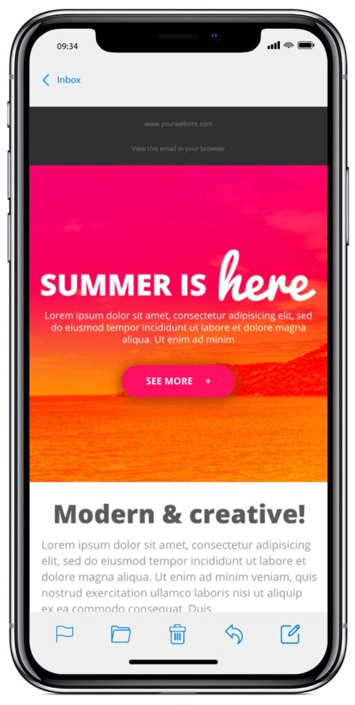
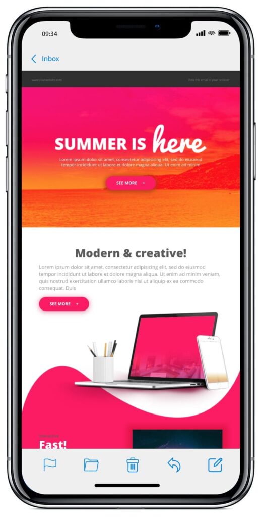
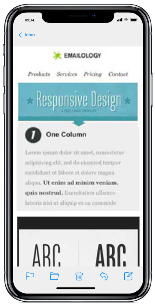
Check out our responsive email template, and what it looks like with and without media queries. With media queries:
Without media queries:
Want to dive into more responsive emails? Check out these responsive design resources here:
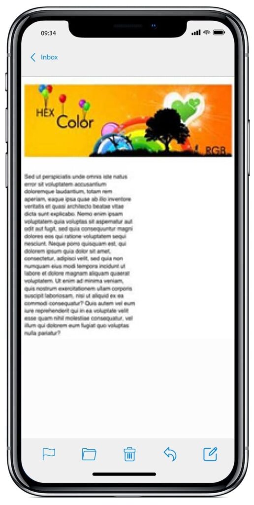
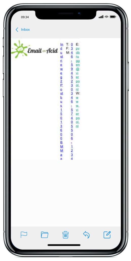
Check out an example of this problem below. In this instance, a table structure forces all the elements to become proportionally smaller. The image at the top is 600px wide and has a smaller table cell below it. In the image on the right, the iPhone reduces the size of everything in the email by about 50% to make it fit the screen, thus making the text tiny. The image on the left is an example where a media query was used to size the image appropriately, allowing the text to take the proper width. With media queries:
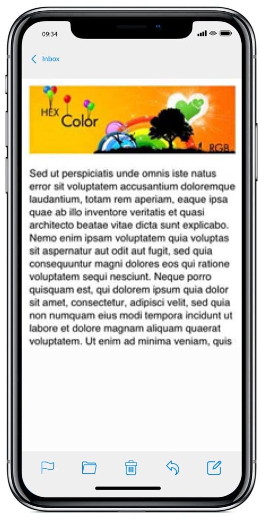
Without media queries:
There are two options to address this problem:
1. Re-size and re-use the same image (better for overall file size)
<style type=“text/css”> @media only screen and (max-device-width:480px; ) { body[yahoo] .header { width:300px} } </style> <body yahoo=“fix”> <img src=“https://www.url.com/image.jpg” class=“header” width=“600” height=“100” /> </body>
2. Completely replace the image. To see how to do this in more detail, check out our responsive image swap.
The effects of the increased font sizes are usually minor, but they can still throw off an email layout. In the example below, you can see that our responsive template’s navigation items take up two lines instead of one because of the iPhone’s font size increase. With text size adjust:
Without text size adjust:

To control the font adjustment in the iPhone universally, try adding this to your embedded CSS:
<style> * {-webkit-text-size-adjust: none} </style>
Or, you can also control text on a case-by-case basis by adding the following inline CSS:
<font style=”-webkit-text-size-adjust: none”> Example </font>
If your text is in a container with a width set to less than that of your text, it might wrap poorly on this device.
To fix this, add word-wrap:normal to your containing element:
<td style=“word-wrap:normal”>text</td>
If you run into an issue with hairline borders appearing in HTML email designs with table layouts, the pros at Campaign Monitor have a handy fix.
Sometimes the iOS reader only displays a small segment of the original email. When this happens, it renders the loaded portion with a button at the bottom that reads: “Download remaining XX bytes.” It looks something like this:
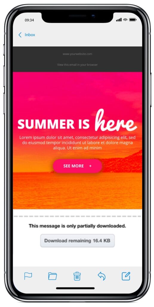
To fix this, make sure you have a minimum of 1,019 characters before your closing <head> tag, including spaces and carriage returns. If you don’t have the need for more styles, or a style block, try inserting several lines of empty spaces. Another option is to remove your <head> tags entirely. Be careful with this solution, though, as some email service providers might place head tags within your email dynamically. Check out this article for more ways to ensure that your entire email is rendered on iPhone and iPad.
By default, Safari on iOS detects any text string that is formatted like a phone number and converts it to a link which allows users to instantly call the number by touching it.

To remove this auto formatting, simply add the following meta-tag:
<meta name=“format-detection” content=“telephone=no”>
We’d love to hear your email tips and tricks for iOS devices. Feel free to share in the comments section below, or hit us up on Facebook or Twitter!
Email on Acid gives you unlimited email previews on more than 70 email clients and apps, including iOS devices. Plus, we have drag and throw functionality as well as the ability to view your email with horizontal or vertical view ports. Try our platform free for seven days and see for yourself!
Editor’s Note: This blog post was updated on August 10, 2018. It was originally published in August 2013.