
A Slick, New Image Swapping Technique for Responsive Emails
Switch Hitter
Being able to switch images for mobile is a handy trick to have for a number of reasons. You can use it to show a cropped version of an image for mobile users or show one offer to desktop users and another for mobile users.
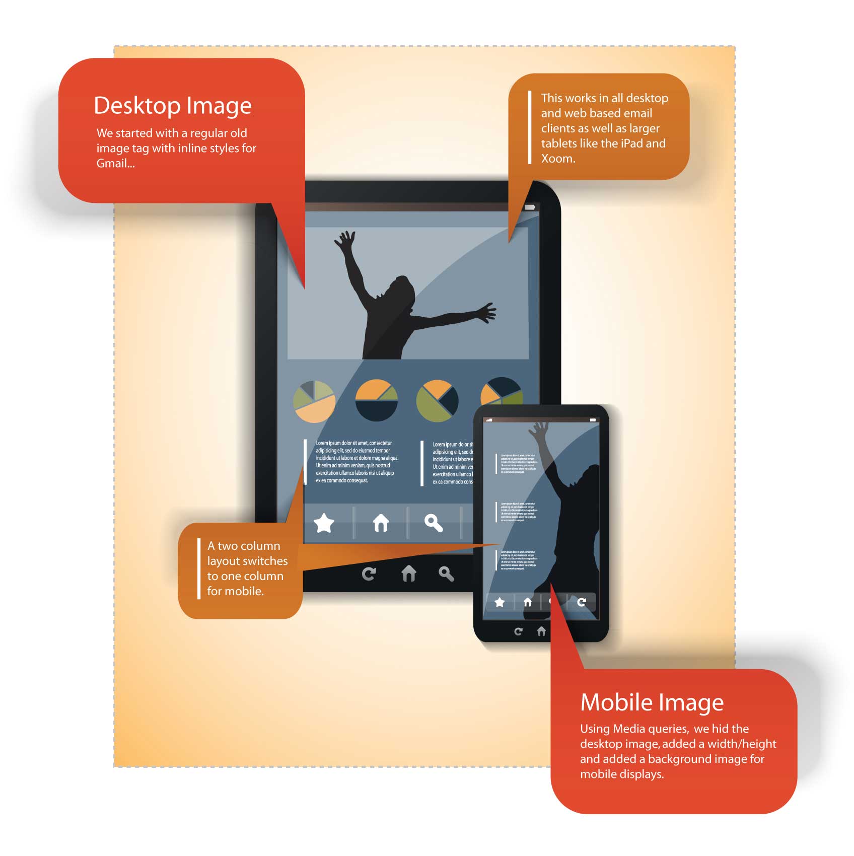
Check out the code for our bulletproof image switch below. This swap should work for all mobile devices in their native apps, as well as all desktop and webmail clients. Gmail ignores the style block (and all media queries), so all Gmail users will see the “desktop” or default image. Let’s start with the image itself.
<span id="switcher">
<img id="houdini" src="https://www.sample.com/desktop.jpg" alt="">
</span>
As you can see, this technique requires no inline styles. All of the magic is accomplished through CSS. This image is the default image, and will appear on all desktop clients as well as all Gmail clients.
Now for the CSS.
<style>
@media only screen and (max-device-width: 489px) {
span[id=switcher] {
display:block;
background-image: url(https://www.sample.com/mobile.jpg) !important;
background-repeat: no-repeat !important;
background-position: center !important;
width: 300px !important;
height: 250px !important;
}
img[id=houdini] {display: none !important;}
}
</style>
Inside of the media query (which will trigger on iPhones and similar hand-held devices) we will set up the image swap. This requires a few steps:
- Make the span into display:block
- Put a background image on the span and position it
- Assign a width and height to the span
- Hide the original image
Swapping Linked Images
This gets a bit trickier when you want to show/hide images without losing your hyperlink. When you hide a linked image with display:none, it will also hide the hyperlink. Technically it’s not gone, but the area becomes too small to click and impossible to touch. I used a span in my example because you can wrap a link around it with no problem, thus preserving an area for touchable links on mobile devices. Check out the code with the link added, below.
<a href="https://www.emailonacid.com">
<span id="switcher">
<img id="houdini" src="https://www.sample.com/desktop.jpg" alt="">
</span>
</a>
And that’s it! The perfect image swap, or at least as perfect as it can be with Gmail around.
What creative uses for image swapping do you have? Let us know in the comments below.
Author: Kyle Lapaglia
58 thoughts on “A Slick, New Image Swapping Technique for Responsive Emails”
Comments are closed.
In theory this is a very solid technique of swapping images but is this something which people should be doing?
If we go back to the very reason why responsive design is so important, it comes down to usability. By ‘swapping’ images out you essentially have double the amount of images in your email meaning double the amount of download time which if you are on a slow 3G connection is pretty disastrous.
So… like I said, good in theory, not the best in practice.
Thanks, Geoff, for working through this issue with us. We were horrified last week when we realized that iPhone 4 was no longer rendering the hyperlink for our swapped image.
I’m reminded of Stig’s quote in your recent post:
“Once you whack a bug in one of them, another pops up somewhere else. Even code that you could swear hasn’t changed since your last test will suddenly break in an email client which hasn’t changed in the last decade.”
Since our office all uses iPhone 4/4S, meaning that’s the main device we’re able to perform hands-on testing with, I’m left to wonder whether our mobile-swapped “call to action” images were ever clickable in Android 2.3+ and other mobile devices. They LOOKED fine in our EoA previews from each device, but until this behavior changed on iPhone we’d have never considered the possibility that this key functionality was missing…
-Jeff B, rockcreek.com
Stephen,
I wouldn’t recommend swapping *every* image in your email. I’d choose one, probably one that will be above the fold. Even then, I’d only do this if the original image wasn’t “ideal” for mobile, or if you had a special gimmick. You’re right that it’s important to be aware of email size and download time. Thanks for the feedback!
Jeff,
No problem. Thanks for the blog idea!
@Stephen,
I think there are many uses for swapping images:
1.) Maybe you have a large headliner graphic and you want text to appear above the fold on mobile so you swap from 300px to 100px high.
2.) In the case of the infographic above, you could transform the look of your email for mobile by hiding your headline graphic and using a similar graphic in the background for mobile.
3.) If you are trying to slim down in vertical scrolling for mobile, you could swap images to control scrolling.
4.) You could change your CTA for specific devices. For example: “Order on your iPhone Today!”
Load times might be effected slightly on mobile but if your media query conditional returns false, your load times will not be effected on Desktop, Web, nor large tablets.
Hi,
can you check the link to the code, I get a 404
thanks,
Paul
Paul,
Sorry about that, should be working now.
Hi Geoff,
Is there a way to swap links? In other words, if someone is on an iphone, they get a link intended for iphone users…but for desktop users, they get a link for a desktop landing page. Kind of like image swapping. Thanks.
AJ
Can you confirm that image swapping (via media queries) works with the popular Gmail app for iOS and Android.
We have tested this excessively and due to Gmail’s silly limitations regarding media queries and certain CSS, we decided to skip image swapping in our emails completely and still with good old fluid designs.
Interested to hear your take on this.
@AJ,
Not that I know of, but that’s an interesting idea!
@Lateral Group,
The image will not be responsive in the Gmail app, because that app ignores the style block (and all media queries). However, those users will still see the “desktop version.” That’s pretty much the best a designer can do for Gmail, I think 😉
One thing to keep in mind when you’re looking at using this method is that the new Blackberry Z10 supports media queries in emails, but doesn’t support background images (https://litmus.com/blog/blackberry-z10-email-support-webkit-rendering-responsive?utm_medium=login&utm_source=litmuslogin). While it’s a pretty new phone, adoption rates look to be growing steadily for it, so it’ll be good to keep an eye on your audience usage of BlackBerry, as well as future BlackBerry OS updates and whether or not background image is supported.
@Lateral and @Geoff,
Image swapping for in the Gmail app on the iPhone but not Android. I found this somewhere on the Internet and customized it myself:
@media screen and (min-width: 0px) and (max-width: 480px) { table[class=”contenttable”] {
width: 320px;
}
td[class=”320width”] {
width: 320px !important
display: block;
}
img[class=”swap”] {
content:url(“swapped-image-here.jpg”) !important;
width: 200px !important;
height: 200px !important;
}
…
And in the html:
Hope this helps…
Thanks, @AJ.
Thing is – as far as we have tested this – because Gmail is not supporting media queries, both images will always display. If it was just about displaying the desktop version we’d be ok. But the image swap is created an unwanted result.
@AJ,
I tried the code you posted in the Gmail App on the iPhone and it displayed the desktop version, no swap. As far as I know, Gmail strips all code from the style block, meaning that no tricks or workarounds are possible.
@Lateral Group,
The image swap we have provided above should display only the desktop version of the image in Gmail and Gmail apps, and not the mobile one as well. Because Gmail strips the whole style block, it would never even see the code containing a link to the mobile image. Do you have a test where you see both images that you can share with me?
Wow I don’t know what happened to the html code I put in earlier but it should be this:
As you can see, it now calls the “swap” class once it’s in mobile mode.
@AJ,
Tried this again with no luck. There should be no “mobile mode” as Gmail strips all code from the style block. Are you sure you’re not in the native app? I’ll try updating my app…
@Geoff, it’s the gmail app on the iPhone. I tap the ‘mail’ icon > under “Inboxes” there’s a section for “Accounts” and tap Gmail. This is the Gmail App, right?
@AJ,
No, you’re connecting the native app to Gmail. Media queries will work in the native app. If you go to the app store and search “Gmail” you’ll find the Gmail app.
@Lateral and @Geoff – I just tested this and it works for me on the iPhone (iOS 6.1.4) Gmail app, not on Android (ICS) Gmail app. Here’s the complete code:
<html>
<head>
<style type=”text/css”>
html {-webkit-text-size-adjust:none;}
.ReadMsgBody {width: 100%;}
.ExternalClass{width: 100%;}
table {border-collapse: collapse;}
body {
background-color: #ffffff;
padding: 0;
margin: 0 margin:0px auto;;
}
@media screen and (min-width: 0px) and (max-width: 480px) { table[class=”contenttable”] {
width: 320px;
}
td[class=”320width”] {
width: 320px !important
display: block;
}
img[class=”swap”] {
content:url(“swapped-image-here.jpg”) !important;
width: 200px !important;
height: 200px !important;
}
}
</style>
</head>
<body>
</body>
</html>
I’m having an issue with the switcher/houdini code in outlook.com, in IE 9 specifically.
What I think is happening is that, in Outlook.com IE9, it is seeing the CSS style for the switcher and houdini. Ignoring the fact that they are just for the smaller screen size. It is hiding the image. So all I see is a blank area that has the height and width of the image.
I didn’t know if you have come across this yet or not and thought maybe you could help us out?
I did notice this issue after Outlook.com went down last week. Not sure if that has anything to do with it. Any help or advice is greatly appreciated!
I kind of knew this would happened…I figured out what I did wrong. I had “max-width” instead of “max-device-width.” Now the email works fine.
@streamcompanies, we’ve been putting our responsive styles in an external style sheet. Webmail clients don’t recognize them, but mobile devices (the place you want the emails to respond) do recognize them. Let me know if that works out for you 🙂
@Trisha, does that work in Outlook? And Gmail app on phones? Nearly 70% of our Gmail access is via mobile phones.
@PKHunter,
To my knowledge, nothing in the style block works in Gmail or Gmail apps, including external style sheets.
@PKHunter– this method works to keep reponsive styles from showing in the desktop. Responsive emails have never worked in Gmail on the web or the Gmail apps. They do, however, work if you load a gmail account into the Android or iPhone native mail apps. Let me know if you need more clarification.
Doesn’t work on my test page here:
http://tailsofhollywood.com/index444.html
although your code does finally make the link to an external site work, unlike every other css image swap code I have found. I want to replace all the js image swaps on this page to css. Can you advise on what might be making the image not actually swap on my desktop browser? The link (and the custom cursor css code) work fine, but the hover does not. Thanks!
Hi Geoff,
Nicely done, but I should mention that this can cause problems if you don’t have anywhere that either you or your client are happy for images to be hosted as from the email marketing software apps I’ve used, they require a full URL (background-image:url(‘http://example.com/myimage.jpg’);) rather than a relative url (background-image:url(‘myimage.jpg’);).
Just my 2 cents 🙂 Nicely done anyway!
Charlie
@Charlie,
Thanks for the comment! Yes, as in the example, you will need to use absolute references. That’s true for all images in HTML email, in my experience.
Geoff – this has been a useful snippet of code for me. V useful, so first off – thanks.
My problem is that my design essentially wraps your code (with some swap out image dimension amends) in a table that houses a class that defines the width of the table, and contents, at each breakpoint – bog standard stuff. The weirdest thing is that on Samsung phones (galaxy s2,3 and 4) the swapped out image appears for a second then disappears!
It’s destroying me. If you can help, you’d be doing a man a favour.
Many thanks – Ben.
Found this article after having independently developed the exact same technique to meet some product requirements. We’re using it to generate fresh content in our emails, which are mobile-optimized. The images I’m swapping in actually are meant to mimic the look of the html in the rest of the email. The problem I’m having now is with the size of the image. Since the content is generated dynamically I don’t have a height. Currently I have ballparked heights for various device widths, which sometimes leaves awkward gaps. It seems to me that that I can’t do better than that since divs can’t be scaled to their background images. Am I missing something clever? Or dumb?
The “Check out how the image swap looks in an Acid Test.” link above is bad.
Eric,
The link should be fixed now. Sorry about that!
Thanks, Geoff. I’m looking at the imageswap.html page in Safari on my iPhone 5 and the image is the correct one, but it’s tiny. It’s taking up maybe a 1/3 of the screen horizontally… tucked into the upper left. Any idea why? Thanks!
Eric,
Not sure about safari and how it sizes things. The iPhone previews you can see in the example are all in the native mail client.
Is there any way to get the ALT text to display in the mobile version of this image swap? So far, I’m able to get everything except that working in this mighty elegant solution!
Thanks,
Dan
The example with link above, I guess the extra span is not require if you apply all those styles to anchor tag itself. display:block, height, width and background image to anchor should work.
Hi, This works perfectly, but i’m having trouble applying this to more than one image in my document.
Can anyone suggest?
I have tried copying the ocde and just changing to ‘switcher2’ as opposed ot one but have had no luck.
Thanks
CRaig
Thanks this helped me out of a huge jam. What would be the advantage of using this over only using css display none on the image you want to hide on mobile and display block !important on the image you want to show in mobile?
Just curious, I am kinda new to the frustrating world of email development?
sean,
If I remember correctly, your solution wouldn’t work properly with Gmail. I’m not sure exactly though, as I haven’t been working with this code for a while. Take our testing tool for a spin and try it out yourself!
Hey Geoff, I was wondering if you or anyone else had an issue when using this technique where the background image looks blurry on mobile. I optimized the jpg to look good (85 quality setting in photoshop’s save for web feature). It looks good on my computer, on my phone looks blurry.
So I did an interesting test where I viewed the html for the email on my iPhone4 using mobile safari and the background image was not blurry. Whereas when I use mailchimp to send the email it looks blurry on my phone.
Thanks!
Rich,
in one email? In this way you could compare (background vs. img) and see if it’s the background part that’s causing the issue.
No, this is not an issue I’ve heard of. Have you tried viewing the image (sent from MC) on your phone with it as a background and as a normal
Thanks, that is sound advice. I gave that a try and the image is equally blurry both as a background and regular img. I think the problem is that I may have been just a little too critical of the image quality. Looking at it again after taking an hour break and now I think the blurriness isn’t as bad as I thought. Maybe there was some caching going on.
Thanks for getting back to me so quick.
hi, I used the working exemple: imageswap.html. And i immediatly try to send it with thunderburd.
and it doesn’t work for me. i mean that when i send it from thunderbird to my iphone, my iphone doesn’t show any pictures at all.
I use the insert html button and paste the intire code in it.
I can see the green scare on my desktop but on my iphone 4, nothing appears at all after a short loading.
i’m on ios 7 , iphone 4.
do you think thunderbird is changing the code when i pressed send?
what do you use in order to send your email?
momo,
Yes, Thunderbird will modify your code when you send it. Marketers generally don’t use Outlook, Thunderbird, Gmail or any of those to send out their email campaigns for this reason (and others). You might want to take a look at http://mailchimp.com/ or https://www.campaignmonitor.com/ if you want to send out marketing emails.
Hello,
Is there any way of making the mobile image swap responsive? Or is this best achieved through a couple of media queries targeting the smallest screen size we test for as well as a larger iphone 6+ size?
geardigital,
I’m not sure what you mean with your first question. This is a responsive technique by definition.
Yes, you could use media queries to target different screen sizes and serve different pictures or the same picture in different sizes.
This works well in most email clients, however by using background images you lose out on alt tags 🙁
Does anyone know a way around this?
@Simon there is a way to keep alt tags:
1- add a transparent gif 1×1 (align left)
2- Delete main image by css, increase the width and height of 1×1 transprent gif (add alt tags)
You’re done.
Hi @Giovanni Mora – any chance you can post a sample of that ALT tag fix? I’m not quite sure I follow. Thanks!
Hi Geoff,
How can I avoid having 2 alt tags when my email is scaled down to mobile? So I am swapping an image for mobile. When I preview in firefox at iphone size I get 2 alt tags.
Thanks!
Matt,
I am not sure where you are getting the second alt text from. My example only includes alt text on the original image. A background image would not normally include alt text.
Thanks Geoff! This is a great post. I’m reasonably savvy with HTML and CSS but often need posts like yours to help me with all the ugly grudge work. I can do the fine tuning and tweaking for the images, but you’ve done a great job on this one! Also love the Email on Acid domain name. Keep up the great work! Cheers from Oz, Bill
Hi,
Very useful technique. The issue I am encountering is that I am trying to set the mobile specific CSS to width: 100%; height: auto. I don’t want to use fixed dimensions as the rest of the body of my email rescales to 100&% of device width. I was hoping changing display to inline-block might solve this but alas, I am stuck with either an image in fixed dimensions or no image displaying at all. Do you have any ideas?
If anyone is interested the solution was adding min-width and min-height values, duh!
Great to hear you were able to get this working in the end, Bloody Marvelous. Good work! Just out of curiosity, did you also need to include something like “background-size: 100% auto;” in the switcher span as well, to get the image itself to stretch to 100% wide there?
@Stephen Jesson – correct 🙂
Thanks for all your great HTML email insights, Geoff. I found this one recently and put it to use on a few client email templates where the header image containing text looked too small on mobile, so I swapped out another image with larger text.
One problem I ran into was dealing with fluid images that were 100% width and auto height, so I decided to use opacity:0 instead of display:none on my img tag and left out the width and height for the span tag. This also meant adding a background-size:cover to the span tag to make sure the swapped image filled the space. Lastly, the swapped image had to have the same width/height ratio, otherwise it would be cut off based on the original image’s dimensions.
Here’s the CSS:
span[id=”header-mobile”] {
display: block !important;
background-image: url(“images/hero-mobile.png”) !important;
background-repeat: no-repeat !important;
background-position: center !important;
background-size: cover !important;
}
img[id=”header-desktop”] {
opacity: 0 !important;
}
Support for opacity is lacking for some email clients, but the fallback is just to have the original image show up with the background image behind it, never to be seen by those clients that support @media but not opacity. I think this is just fine.
My only issue came with Outlook 2013, the bane of my email-building existence. For some reason, using your method or mine, a linked image is not clickable. I’m investigating further, but so far it seems like an isolated issue. Thoughts?
<head>
<style>
#switcher {
display:block;
background: url(‘https://encrypted-tbn0.gstatic.com/images?q=tbn:ANd9GcQY2xFICSLTeJuWDALDsvc7YtIAdsNVpDWtRtOaGgPyCaPoGkjUvg’) !important;
background-repeat: no-repeat !important;
background-position: center !important;
width: 300px !important;
height: 250px !important;
}
</style>
</head><body>
</body>
Above code works in gmail and yahoo , but image not display in outlook , mailru.
Any idea?
I’ve been using this technique with no problems until recently, when Samsung Mail (android 6.0) appeared on Litmus. Samsung Mail doesn’t show the desktop image or the mobile image, it just shows a big blank area. Any ideas?