Industry News
Adapt Your Media Queries for Apple’s New iPhone 6/6+ and Watch

On September 9th, Apple announced three new devices they’re adding to the lineup: the iPhone 6, iPhone 6+ and Watch. iOS8 and the native mail client won’t be changing email much, but apparently the screen size will. Of course we haven’t gotten our hands on one of these yet, so it’s hard to know the exact pixel dimensions of the devices. Read on to find out what we do know, and how it could affect your email marketing.
iPhone 6 and 6+ Screen Size
The smaller of the two models, the iPhone 6, is reported to have a 4.7″ screen size and to be 750px wide. In terms of CSS, though, the phone should be 375px wide because of the 2x pixel density. If you’re confused about pixel density, skip down to the next paragraph. The iPhone 6+ has a 5.5″ screen and is 1080px wide. It probably has a pixel density of 2.6x, resulting in a width of 414px for CSS. However, there has been some debate about the pixel density of this phone, with some bloggers saying it will have 3x pixel density. If that were true, then it would register as 360px wide for CSS. Either way, this is a huge change for the industry.
“Pixel density” refers to the number of physical pixels that are considered to be a single pixel for display/CSS purposes. So a phone with 2x pixel density considers a 2×2 block of 4 pixels to be a single pixel in CSS. This enables the phone to show much higher quality images while keeping text readable.
The current standard breakpoint: 320px
Up until now, many email designers have been using 320px as their main breakpoint for mobile. This is because an iPhone screen, such as the 5S, is made up of 1136×640 physical pixels at 2x pixel density, or 568px high and 320px wide for CSS purposes. Because of the massive popularity of the iPhone and the dependability of its screen size, this became the go-to breakpoint for media queries.
The media queries used in our popular Responsive Design Template are designed for tablets as well as smaller phone screens. They look like this:
                                @media only screen and (max-width: 640px)  {
	body[yahoo] .deviceWidth {width:440px!important; padding:0;}
}

@media only screen and (max-width: 479px) {
	body[yahoo] .deviceWidth {width:280px!important; padding:0;}
}
This kind of query should still work pretty well on the new iPhones because the “mobile” view will trigger on any screen less than 480px wide. On the other hand, we are setting the containing table to be 280px wide, which will look pretty narrow on a 414px wide screen. To adapt this template to the new screen sizes, we have a few different options. Check them out below.
Media Queries for the iPhone6 and iPhone6+
You have a couple of options for adjusting your media queries. If you want to target each of these screen widths individually, your code might look something like this:
                                @media only screen and (min-device-width: 413px) and (max-device-width: 415px) { iPhone6+ Styles }
@media only screen and (min-device-width: 374px) and (max-device-width: 376px) { iPhone6 Styles }
@media only screen and (min-device-width: 359px) and (max-device-width: 361px) { iPhone6+ Alt Styles }
@media only screen and (min-device-width: 319px) and (max-device-width: 321px) { iPhone5 or less Styles }
Remember, we can’t be sure of the exact sizes of these screens just yet. These are just our best guesses at targeting these devices. Alternatively, you could set your main container to be 100% wide for all screens at 414px or less, thus capturing all of the new sizes. One way to do this would be:
@media only screen and (max-width: 415px) { Smaller screen styles here }
Apple’s smart Watch and Handoff
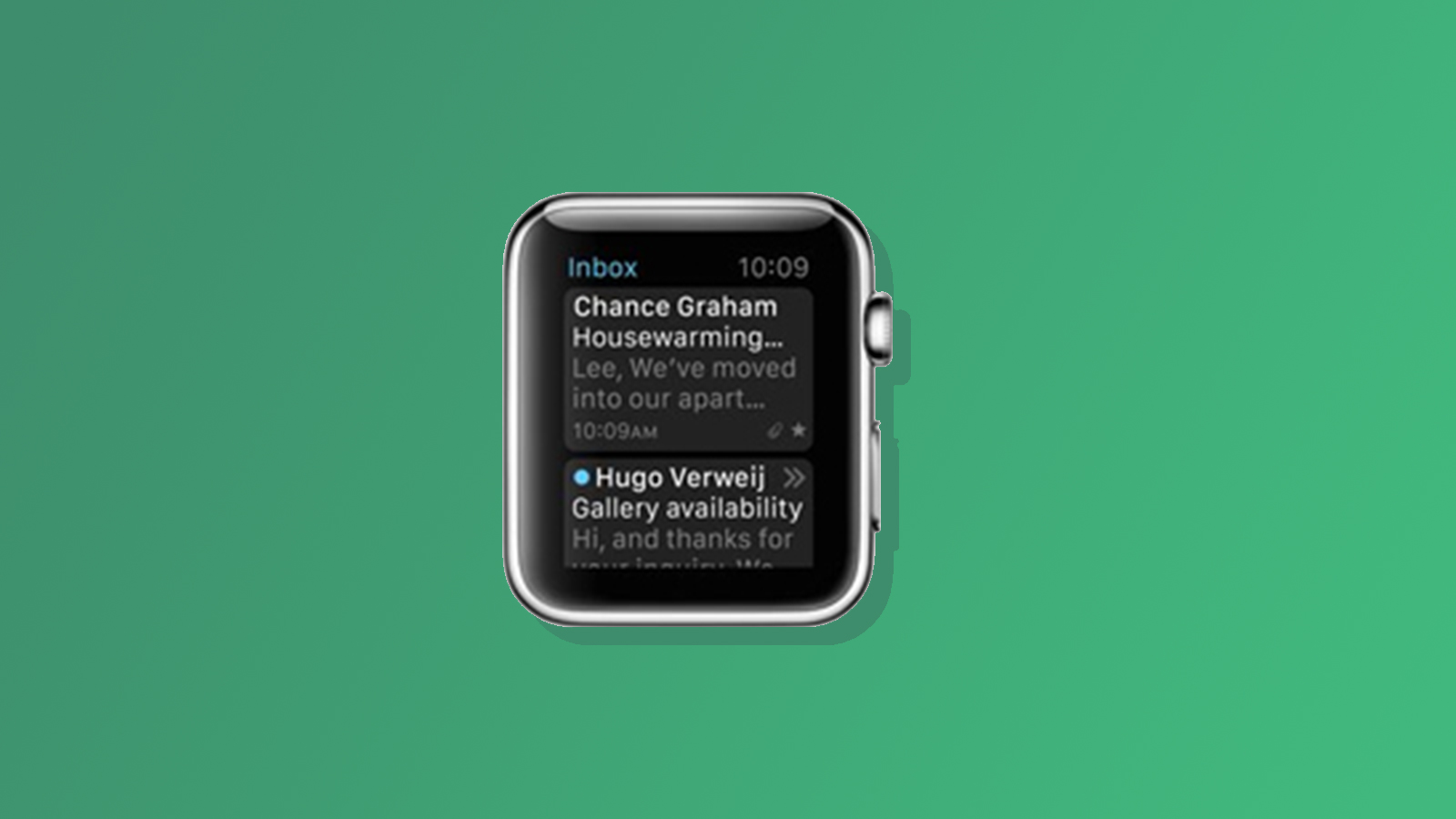
From what little we know, it looks like the new Watch from Apple will have some kind of ability to look at new emails, though it appears to be pretty primitive. We expect this to be text only, and to use the email subject and preheader or first line. If this is the case, preheaders and very short subjects may become more important than ever.
This is a screen capture from Apple’s website.
If your subject attracts their attention, the viewer will be able to activate a “handoff” to their phone, where the email will be opened for reading. It’s hard to say if this new tech will have a drastic effect on open rates or not.
We’re stoked to start testing these new devices so that we can optimize our emails for every user experience. Are you dreading the coming changes, or looking forward to it?


