5 Tips for Writing Alt Text in Email
One of the essential parts of an accessible email is well-executed image alt text (alternative text). That said, good alt text should be a feature of every email, regardless of whether you’re designing for accessibility. Image alt text serves a few different functions. For accessible emails, it can describe images that a visually impaired user may not be able to see. A screen reader will read the descriptions aloud. Image alt text also helps describe an image when a subscriber’s email client blocks images. Below is an example of the alt text we use for our social media icons at the bottom of our newsletters:
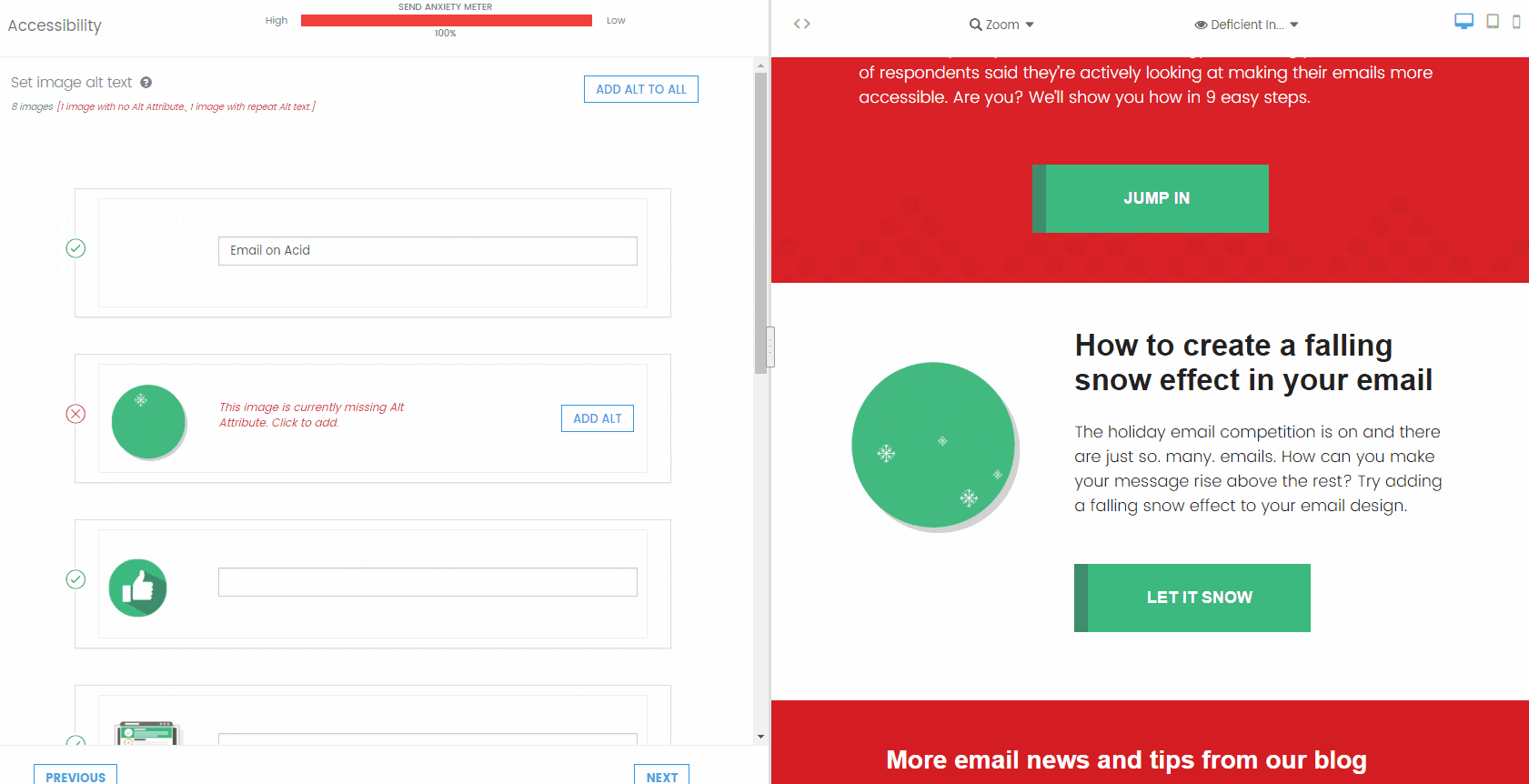
 Whether you’re familiar with alt text or not, there are some important guidelines to remember when adding image alt text to an email. Our new Campaign Precheck feature will help you with some of these guidelines by scanning your email code for alt attributes and alt text and finding and fixing mistakes for you. Try it today.
Below are five steps for crafting the ideal image alt text, which can help create a better experience for every subscriber, visually impaired or otherwise.
Whether you’re familiar with alt text or not, there are some important guidelines to remember when adding image alt text to an email. Our new Campaign Precheck feature will help you with some of these guidelines by scanning your email code for alt attributes and alt text and finding and fixing mistakes for you. Try it today.
Below are five steps for crafting the ideal image alt text, which can help create a better experience for every subscriber, visually impaired or otherwise.
Table of content
1. Don't Repeat Image Alt Text
Try to use different alt text for each image, even if the images are similar. Think about how a subscriber would hear your email if he/she is using a screen reader – will the user want to hear the same image alt text over and over? For example, think of an email that features multiple product images and star ratings for each product. If several products have four-star ratings, it’s not a great idea to use “four stars” as the alt text for each star rating image. Try throwing in the product name or description, such as “Merrell shoes, four stars.” Using different alt text for each image can better inform subscribers and help avoid confusion when a screen reader is reading the email. Campaign Precheck’s accessibility checklist will save you time by flagging repeated alt text in your email. If it finds a repeat, the tool will suggest you update the alt text to improve the email (see example below). That way, you won't need to double-check all your alt text manually.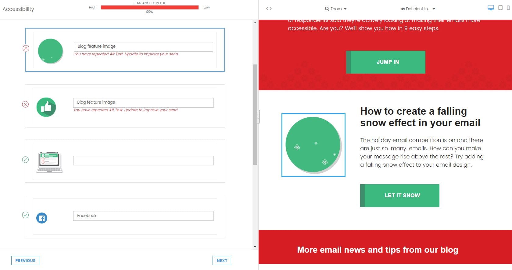
2. Be Descriptive but Watch the Length
Your image alt text should help convey the message of your email – if someone can’t see the image, will he/she still be able to understand what the email is about? If you have an image announcing a sale, for example, be sure to put the sale information in the alt text (such as “30% off blouses and sweaters”). It’s crucial to include those details in the image alt text unless you clearly state the sale information elsewhere in the email. Although you want to be descriptive with your alt text, keep the user experience in mind. Remember that some users may be hearing the alt text through a screen reader. If you need multiple sentences to describe an image’s message, it probably belongs in the body copy of the email. Also, when an email client blocks an image, the alt text will be limited to the width and height of the image container. Outlook also precedes the alt text with a security warning if images are blocked, so it’s important to keep descriptions short and sweet. [caption id="attachment_5720" align="alignright" width="690"] Here's an example of our newsletter header with the Outlook security warning on our logo image (images turned off).[/caption]
3. Alt Text and Title Text Are Not Interchangeable
Some email developers or marketers may decide to add title text in addition to alt text. However, most screen readers will not prioritize alt text over title text and instead, read both. This doesn’t create a great experience for the user. Use alt text to describe the image in your email. With our new Campaign Precheck feature, we’ll save you time and remove all the title attributes for you, so your subscribers using screen readers can better understand your email.4. Use Empty Alt Attributes When Appropriate
Image alt text isn’t necessary for images that serve a design function and don’t enhance the email message. Think divider lines, spacer images or hero images. For these images, it’s important to include an empty alt attribute, which looks like this:alt=””
When you leave the alt attribute empty, a screen reader will skip over the image.
Our Campaign Precheck tool will check all your images for alt attributes. If the tool doesn't find an alt attribute, we’ll add an empty attribute for you. Then, you have the option of adding alt text to the image. There’s also an option at the top of the screen to “add alt to all,” which will add an empty alt attribute to every image that’s missing one.