Optimize Every Email with Responsive Mobile Design

10 Easy Ways to Improve Your Mobile Email Design

28

This post was updated on July 25, 2019. It was originally published in January, 2014.

Mobile email design has seen some changes over the last six years. At least 61% of users now open email on mobile devices, and 31% report that a smartphone is their primary device to click through and purchase.

If your brand isn’t optimizing every email for mobile, or if it’s been a while since you’ve evaluated your email strategy to ensure mobile is a big part of it, now’s the time.

For your email optimization pleasure, here are 10 simple ways to improve your email design for mobile.

1. Keep it Simple with a Single Column Layout

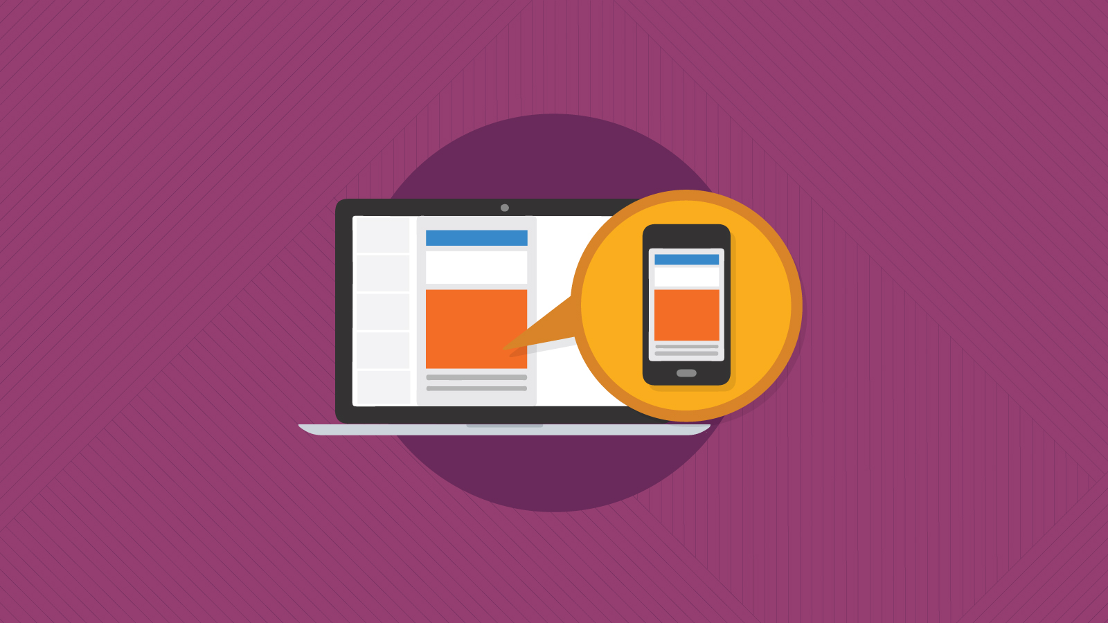
Creating an email design with a single column layout that has a responsive width and font could be the easiest way to create an email that looks and behaves great on mobile.

However, if multi-column is your preferred cup of tea, creating a responsive email template that has multiple columns on a desktop device will stack content on mobile. That said, pay close attention to the content orientation so it stacks in the order you want it to. You can achieve this with a responsive template (like these free Email on Acid templates).

2. Hide/Show Different Email Components

Using the code below, you can hide desktop elements and show mobile elements of an email. For example, you can add a mobile-optimized image that is a better size ratio or call-to-action (CTA)  button that will only display when a user opens the email on mobile.

<style>
@media screen and (max-device-width:600px), screen and (max-width:600px) {
      .hide {
        display: none!important;
        width: 0px!important;
        height: 0px!important;
      }      .show {
        display: block!important;
        width: 100%!important;
        max-height: inherit!important;
        overflow: visible!important;
      }
   }
</style>
</head>
<body>
        <table role="presentation" width="100%" border="0" cellspacing="0" cellpadding="0">
<tr>
<td><img src="images/desktop-image.png" alt="" width="548" height="217" style="display: block;" class="hide">
 <!--[if !mso]><!-->
<div class="show" style="display: none; max-height: 0px; overflow: hidden;">
 <img src="images/mobile-image.png" alt="" width="100%" style="display: block;"> </div>

 <!--<![endif]--></td>
</tr></table>
</body>

3. Resize Fonts & Images

Increasing or decreasing font sizes and images using media queries can quickly and easily create a better user experience on all devices. Using the technique from Everything You Need to Know About Email Fonts, we can change the font according to the viewport width (screen width) of a user’s device:

<style type="text/css">

@media screen and (max-device-width:640px), screen and (max-width:640px) {
.mobfont {
font-size: 2vw!important;
line-height: 3vw!important;
}
}
</style>

Then, we add the class mobfont to any text we want to resize:

<td style=”font-family: ‘Timmana’, Helvetica, Arial, san-serif;” class=”mobfont”>Responsive Text</td>

Similarly, adding a width and height CSS property to a mobile image class can automatically resize an image. The below code will ensure your images are at 100% width of the parent container (aka the mobile device) and the height is set to auto, keeping the image proportions correct.

@media screen and (max-device-width:640px), screen and (max-width:640px) {
.mobimage {width: 100%!important;min-width: 100%!important;max-width: 1000px!important;height: auto!important;} }

4. Get to the Point!

You only have a small screen size to get your message across, and mobile devices are full of distractions. Stick to short, sharp messaging and avoid long, wordy emails.

Adidas's simple, mobile-friendly email design and layout

5. Use Touchable Buttons

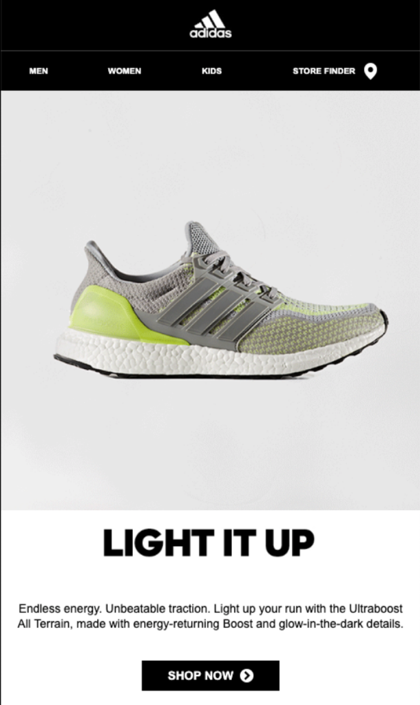
Make your CTA a button, and ensure it has plenty of real estate on mobile, just like in the Adidas example above. Create space around any links so users can comfortably scroll without accidentally clicking a link and possibly getting annoyed at your email.

Tip: Make text links accessible with special characters (>) or emphasize with bold or underline.

Apple recommends at least 44px width for touchable buttons on the iPhone. Remember that you can also make some of the area around the button touchable as part of the same link, as long as it’s not too close to other buttons.

6. Use High Contrast Designs

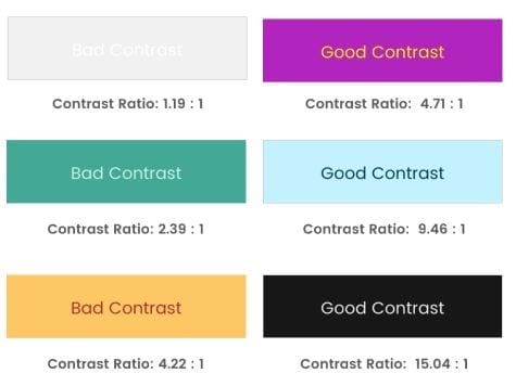
With mobile users conscious of battery life and screen brightness, keeping your designs high contrast will mean better readability. Unlike desktop users, mobile users could be opening your email outside in bright sunlight and the added contrast will really help.

Related: Accessible Contrast Ratios: Why Email Colors Matter

7. Keep it Light

Mobile users aren’t always connected to WiFi and are never wired into the internet. Connectivity issues, signal strength, WiFi speed and even phone memory can impact an email’s load time.

Keep the code for your emails as light as possible (definitely under the 100kb Gmail-clipping limit) and ensure images are optimized to be as small a file size as possible. This will increase the chance of your email loading and rendering as it should.

Tip: Remember to add alt text to images – just in case signal strength is low and images can’t load, you’ll want alt text as backup content. Similarly, if you are using background images, remember to set a background color that contrasts well with any text and CTAs so they can be seen whilst images are loading.

Contrast ratio examples

8. Stick the Landing

After going to all this trouble to make your email mobile friendly, it would be a shame if the subsequent messaging was less impactful. Make sure you optimize the entire mobile experience for subscribers by also optimizing your landing page for mobile.

9. Mobile-Specific Code Fixes

iOS devices can sometimes reformat your email and cause image sizes to be a little odd or change alignment. Adding this handy line of code into the head of your email will keep it from messing with your HTML:

<meta name="x-apple-disable-message-reformatting" />

Adding this to your CSS will stop Apple from highlighting links and changing your formatting:

a[x-apple-data-detectors] {
color: inherit!important;
text-decoration: none!important;
font-size: inherit!important;
font-family: inherit!important;
font-weight: inherit!important;
line-height: inherit!important;
}

Samsung devices will highlight your links and change the color to blue and underline them. Inserting this piece of CSS will stop it from changing the links:

#MessageViewBody a {
color: inherit;
text-decoration: none;
font-size: inherit;
font-family: inherit;
font-weight: inherit;
line-height: inherit;
}

Note: This is not to say that you shouldn’t be emphasizing text links in some way. It’s fine to keep it on-brand, but always make every single link accessible.

10. Test Your Email!

It seems obvious, but since you always have your phone in arms reach, send a test email and make sure it looks as good on your small screen as well as your computer.

I set up the Gmail and Outlook apps and bookmark webmail clients to have a quick look through.

Run a test on the clients and devices Email on Acid offers, including tablets (to make sure your media query is set correctly), and make sure your email looks great everywhere.

Make Every Message Accessible

It only counts as “optimization” when your email is accessible to everyone. Campaign Precheck’s Accessibility feature is the only tool on the market that scans your email for accessibility and makes ADA-compliant adjustments to the code in just a few clicks.

What are your go-to tricks for mobile optimization? Let us know in the comments below!

Give Campaign Precheck a Try!

While you can use our email readiness platform in a variety of ways, we’ve designed the optimal predeployment checklist with Campaign Precheck. It streamlines and simplifies the entire pre-send process for efficiency and accuracy. Log in now to start using Campaign Precheck. Or, sign up for your free trial today!

Start Your Free Trial

Author: Jay Oram

Jay Oram is part of the design and code solutions team at the email specialist agency, ActionRocket. In his role at ActionRocket, Jay is usually experimenting with new code for emails or finding that elusive rendering fix. See more articles from Jay at emaildesignreview.com or find him on Twitter at @emailjay_.

28 thoughts on “10 Easy Ways to Improve Your Mobile Email Design”

  1. The fold still gets mentioned a lot, but I’m not sure it still holds as true as it has done. Even more so on mobile. Because it’s so easy to just flick up and down, have a quick scan and then make a decision, no?

  2. As we all know, the mobile technology has acquired a great change in our life. Today a large portion of the us are using the internet through mobile, smart phones, tablets and other compact gadgets. So it has become exceptionally fundamental for email marketers to focus on creating mobile friendly, responsive email campaigns to gain better results.

  3. @Jaina, I think the fold is still a valid concern. Emails are scanned so quickly that you want your hook to be the first thing that is processed. In some cases, that is NOT the CTA because you have to compel them with a headline or graphic to entice them to read and then click but, as Geoff points out, the CTA is often THE reason for the email and therefore should not be buried.

  4. Very intriguing post Geoff. With a weighty percentage of subscribers accessing their emails on mobile phones, mobile email design undoubtedly needs undivided attention. You have listed in some great pointers with dedicated imagery, which makes it exceptionally clear to understand. I’d like to add that mobile email designs need to be spaced right and link crowding just cannot be an option. We have it elaborated on http://www.emailmonks.com/blog/email-marketing-mobile/mobile-email-design-best-practices/ Hope you enjoy reading it! 🙂

  5. Thanks for this incredible guide, Loved your post.
    Its one of the best article I have read till date.
    I am glad that I found this informative blog.
    Thanks for posting !! Keep Blogging !!
    Looking forward to know more from you.

  6. Hi Jay, its really good to read your post about email designing. Actually, I’m looking for a good email template that will not bounce and reach in potentials customers inbox. I’m going to target our earlier customer at LeatherJacketsUSA.com. We’re using Mailchimp platform and hotjar as well for analytics.

    I look forward to hearing from you. Thanks in adbance

  7. The fold still gets mentioned a lot, but I’m not sure it still holds as true as it has done. Even more so on mobile. Because it’s so easy to just flick up and down, have a quick scan and then make a decision, no!

    1. We sure hope so, Olivia! Scrolling is definitely a super easy action, but unfortunately there’s no guarantee that every subscriber will. Considering “the fold” can include considering the length of the email and how far past the fold subscribers will be willing to scroll. We do recommend brands use Email on Acid’s Heat Mapping Analytics to understand this subscriber behavior more intimately in order to strategically plan their emails’ layout and length.

    2. Hey Olivia – It is something that is up for discussion and whether or not there is a fold, but we do know that users often scan emails (under 2 secs) so it is unlikely they can scroll all the way down to the bottom and take in all the information.

      If you want to get information across it is well worth putting important info at the top and make it eye catching.

      The ‘fold’ is more the email preview in an inbox or what users first see. We did a (not hugely scientific) study over at http://www.emaildesignreview.com/action-rocket/results-from-our-emailweekly-test-4083/ It showed that the fold could be anywhere and a large majority of clicks happen at the top of our emails. But you should test your own audience.

      Hope that explains a little of what I meant by the ‘fold’ – Jay

  8. Hi there. Thanks for touching base. We at Email on Acid tend to specialize in email testing vs full website testing. However, if you have additional questions, one of our customer specialists can certainly help. We’re available to chat via the website or you can give us a call +1 (844) 568-0111 (US).

  9. So glad you found our post informative. We post often, so please check back for more email QA tips and workflow advice.

    1. Excellent Jenny! Thanks for the positive feedback. Happy to hear it. We at Email on Acid love providing tips of the trade to our community. And we get excited when you guys like the content we create.

  10. Faruk, glad you find our posts helpful. Please keep reading! We love to share our findings with the email community.

  11. Excellent. Feel free to give any of our blogs a read. Ha! Also, don’t forget to sign up for a free trial of our platform. You can check every component of your email, from preheader text to how your email renders on certain clients. You can sign up on our website. Happy emailing.

  12. Just please be careful with !mso conditional formatting. I’ve found that content<!– doesn’t work across modern clients, but content<!– does.

    1. Great note Bart. Thanks for the warning. Feel free to give any of our other blogs a read. Ha! Also, don’t forget to sign up for a free trial of our platform. You can check every component of your email, from preheader text to how your email renders on certain clients. You can sign up on our website. Happy emailing.

  13. So many younger developers seem to miss Point 7. Having grown up with decent internet speeds a lot just don’t seem to get it.

    Last week I received an email with an animated Gif header. While I’m a big fan of animation, this things was epic… When you get video that’s an animated GIF you know the file size is going to be large…

    Yeah 18MB!!!! seriously what were they thinking!!

    1. Great point Nick! And those users on Outlook definitely feel your pain with GIFS. Thanks for checking out our blog. Check back often for more tips and tricks.

Leave a Reply

Your email address will not be published. Required fields are marked *