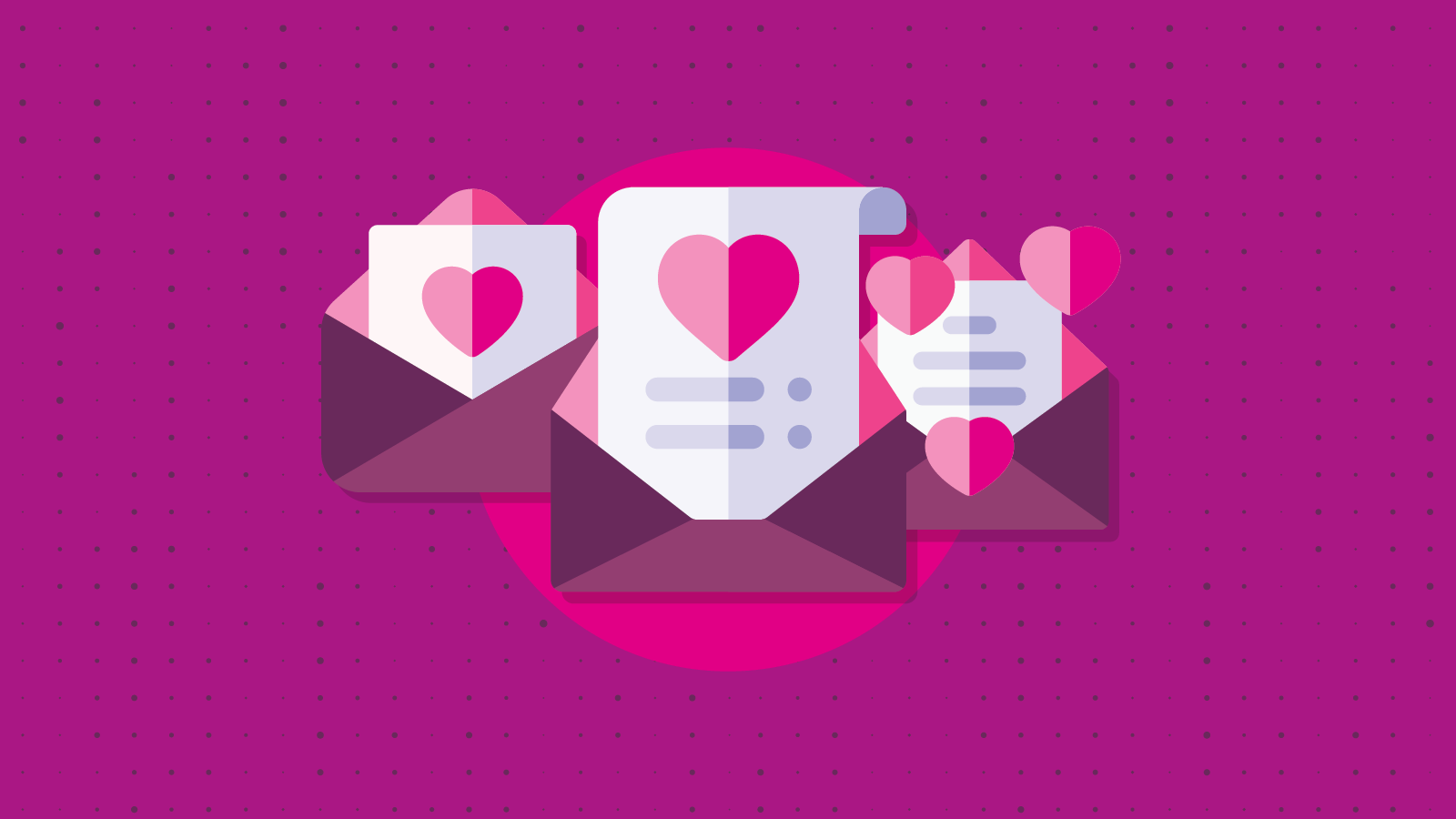
Email Marketing
9 Essential Design Elements of a Conversion-Driven Template
You A/B test your subject line, toil over every word in the text of your email and segment your list to the T, but what are you doing to optimize your email’s layout? The design aesthetic of your email template is just as critical as the words you use. So let’s take a look at nine design elements that will help to boost your bottom line.
Use 600px for email width
Keep your email’s width close to 600px. This is the standard width for most emails and will fit nicely on web and desktop clients.

This is a screen capture from sitepoint.
Outlook, Thunderbird and Apple Mail have a preview window with a limited size, so 600px is the way to go. And don’t worry about the size rendering well on mobile devices. We’ll cover that in the next section.
Design for mobile first
In the early 90’s, the web development community approached email development with graceful degradation mindset. Now, the progressive enhancement approach for development is taking over, which means designing for mobile first.
While the actual template design should be responsive overall, it takes more than just media queries to ensure you’re developing with mobile users in mind. To optimize emails for readers on the go, you need to employ a content hierarchy and put the most important information first.
The first thing needed to do this is to implement single column design. Using a single column will help your email to fit the screens of smaller mobile devices well, and also allows you to draw the reader through your content in a linear fashion.
Another good trick to keep your email clutter-free and scannable is to hide content on mobile. This can be especially useful for content that links to a page that’s not mobile-friendly. If it’s not the main objective of the email, you may want to just hide it from mobile users. Giving less options can really improve your click-through rate on your main call to action.
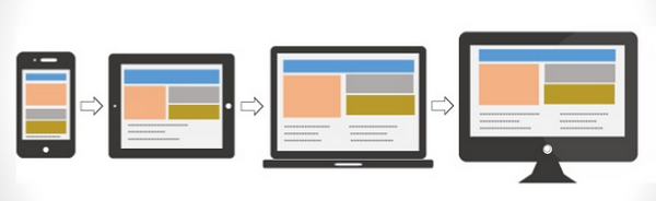
Utilize fluid hybrid design
An estimated 66 percent of emails are being opened on mobile devices. On top of that, 70 percent of smartphone users say that they will delete emails immediately if they do not render properly on their device. So if you aren’t paying attention to the way your emails look on phones and tablets, your campaigns (and brand and return on investment) are likely suffering.
While every design element in your email template is critical to your success, ensuring your email is responsive is the most important technique you need to master.
The best mobile experiences in email are created with the use of responsive or fluid hybrid templates. Fluid hybrid design is replacing media query-based design as the go-to framework for responsive emails because this “spongy” design technique ensures your email is responsive even on clients and devices with awful support for modern CSS.

Need a fluid hybrid template to hit the ground running? You can access Email on Acid’s free hybrid fluid template that has been tested across the most popular clients and devices.
Incorporate visual elements
The old saying, “a picture is worth a thousand words,” still rings true in email marketing. About 80% of your audience is scanning your email anyway, so a relevant image is critical to communicate your message.
When deciding what images to use in your email, one type will always resonate: images of people. Images of faces are processed in the “fusiform face” area of the brain, which also processes emotional responses. These images allow your reader to create an emotional connection with your content and brand.
In the email above, charity:water does a fantastic job of pairing the image with the text. Both elements work in unison to tell a compelling story that will pull at your heart strings.
Avoid emails that are entirely image-based
While images should be an element in your template, they shouldn’t be the ONLY element. Some clients will block images by default, and some users change their settings to block images so that they can save data. If image blocking is on and you are relying on those images to tell the whole story, your carefully crafted email won’t communicate anything!
Below is an example of an image-based email when image blocking is turned on:

Even the “right click to download images” message isn’t very prominent or compelling. To prevent this type of inbox experience, always include descriptive alt text for your images. Check out Hubspot’s article on How to Add Alt Text to Your Email Images for a helpful walk-through.
Choose your font wisely
Your email needs a font that’s not only easy to read, but that also reflects your brand and provides a consistent look and feel across all channels.
Font size is another important thing to consider, because you want to ensure that your font will appear larger on mobile phones to prevent the need to pinch and zoom to read your email. Apple recommends a default of 17px font for body text, and an absolute minimum of 11px. Android recommends a default of 16px font for body text, and an absolute minimum of 12px. You should keep your body font size at 16 or 17px to appease these requirements, and smaller text (captions or footer text) should be at least 12px.
Research has found that Courier and Verdana are the most legible fonts and that Arial and Verdana are the general preference for font type by readers. Most importantly, make sure you are using email safe fonts. Here is a short list of fonts that should be supported universally:
- Arial
- Arial Black
- Comic Sans MS
- Courier New
- Georgia
- Impact
- Times New Roman
- Trebuchet MS
- Verdana
- Σψμβολ2 (Symbol)
- Webdings
Leverage lines to create order and organization.
Lines create order and organization. So whether you use a thick bold line or a faint, grey one to separate elements, be sure to leverage this design tactic so your email doesn’t create confusion and visual frustration.
If your email features different types of content, clearly define sections by using dividers or borders. Failing to do this turns your email campaign into a Where’s Waldo game your subscriber may not want to play.
In Cook Smarts’ newsletter above, they do a fantastic job of leveraging lines throughout the entire email to ensure all their healthy tips and recipes are laid out in a clear, orderly fashion so it doesn’t look like a recipe book exploded in the recipient’s inbox.
Embrace negative space
Don’t feel the need to fill every bit of real estate in your email template. Whitespace is important because it separates groups/elements for easy consumption, adds emphasis and invokes imagination.
Balance text and images within the template with white space, a.k.a negative space, to allow your reader’s brain to quickly interpret, consume and scan the information presented.
There are two types of white space:
- Active white space – White space that is added with a conscious effort to break up elements and encourage the reader’s eye to jump from one section of the email to the next.
- Passive white space – White space that occurs naturally within the design. For example, the white area between words on a line or the white border around an email logo.
The template below from envatotuts+ makes good use of negative space. As a reader, your eyes skim the content and digest the different elements with ease.
Remember when you are designing your next template: What you leave out is just as important as what you add in. Want more helpful tips for understanding email layout and structure, click here!
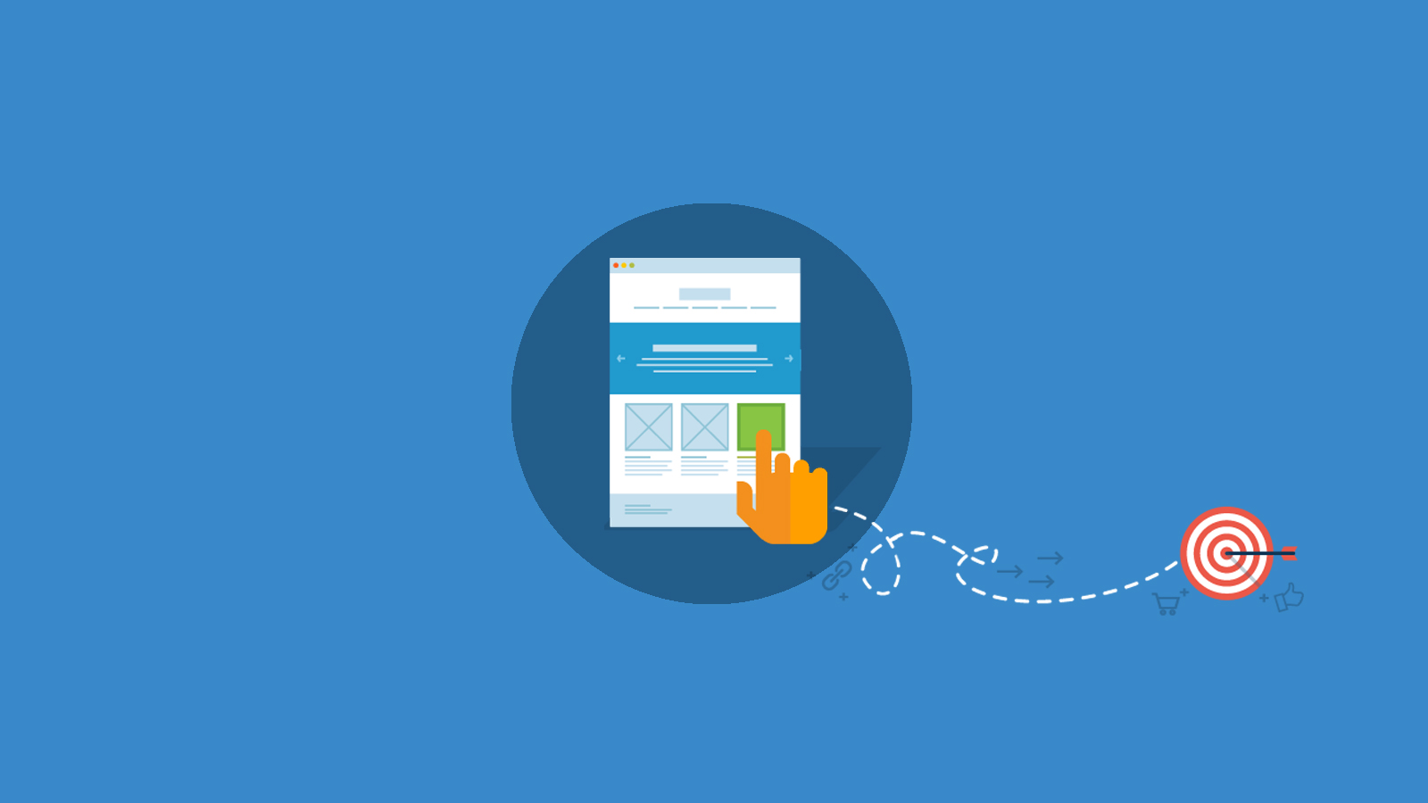
Include a prominent call to action
If you go through the effort of creating a killer subject line and compelling content, it is an EPIC fail if you forgot to optimize your call to action (CTA). To give your CTA the attention it deserves, be sure it stands out from all the other elements in the email.
The first way to accomplish this is through color. The color of your call to action should be different from the background color of the template and text.
Relative size is next. Consider the other elements of your email to determine the size of your CTA. Hubspot also has the helpful measuring guide, shown below.
Finally, don’t use an image for your CTA. As was previously mentioned, many clients block images by default and if your CTAs are embedded in images, your readers might miss the most important element of your email.
Instead, use bulletproof buttons. Bulletproof email buttons are designed using progressively enhanced VML and CSS so your CTA comes through, regardless of image blocking. To implement these, check out EOA’s article on The Last Bulletproof Button You’ll Ever Need where you can get your hands on the code to make sure your CTA is always front and center.
Did we miss any mission-critical email design elements?
Share the email design elements that you incorporate into your template to optimize your ROI in the comments section below.