Email Marketing
7 Elements of a Conversion-Driven Landing Page
Creating an astonishing email campaign is only half of the equation when mastering the email conversion process. The other critical piece of the pie that deserves just as much time and attention is crafting a dedicated landing page. If you put all your blood, sweat and tears (ok, maybe just tons of your time) into getting your audience to click-through, it would be an epic fail if they were brought to a bland, basic landing page that falls flat. The question is, what elements does a landing page need to make your audience stick? In this blog, I’ll cover 7 key characteristics that will make your landing page a conversion-driving machine!
Craft an Engaging Headline
You can spend hours and hours crafting beautiful text, designing awesome supporting visuals and making a fantastic offer, but if your landing page’s headline doesn’t instantly grab your reader’s attention, you can say bye-bye to that conversion. Copyblogger reported that 8 out of 10 people will read headline copy, but only 2 out of 10 will read the rest so before you EVER send a prospect to your landing page, ensure your headline will hook them.
The headline is your 2 second chance to draw a reader in. In order to make sure it’s money, check out these tips:
- Split test your headline to see which opener gets better conversion rates.
- Tell what’s inside instead of selling what’s inside.
- Clarity trumps cleverness, so make your headline is clear and concise.
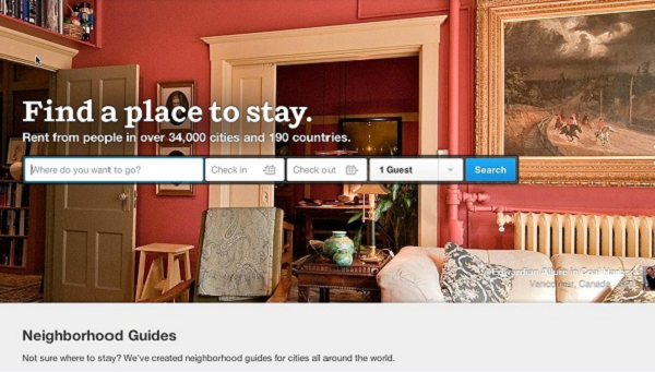
- Ensure your headline refers directly to the place from which your visitor came or the ad copy that drove the click.
Below is a headline pulled from AirBnb that leverages the tips above to create a crystal clear headline that sets their readers expectations in seconds:
Use One Call-to-Action
It can be tough work to get someone from your email to your landing page, and even harder to convert them, so don’t make your life even harder by adding multiple CTA’s. Any extra links or calls to action will distract your viewer, move them off your page and POOF, there goes a sale.
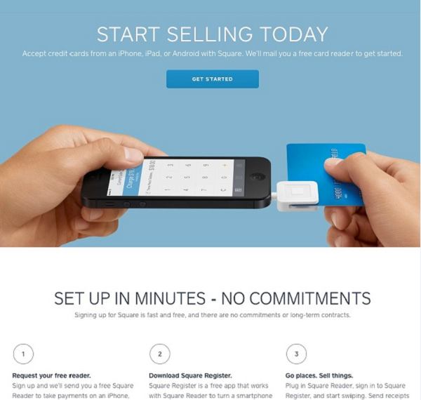
It’s also important to note that since you only have one distinct call to action, make it prominent on your page. Ensure that your CTA button is centered and visually distinct from your copy and the other elements on your page.
Squareup’s landing page below is a great example of encompassing a singular, centered CTA that allows the visitor to jump into the copy with ease.
Incorporate Responsive Design
Since we’re in the business of ensuring your email looks fantastic across all email clients AND mobile devices, we harp on the importance of responsive design for your email. One thing we haven’t talked about when it comes to responsive design is that it is just as important to use on landing pages as it is emails!
61% of consumers read at least some emails on a mobile device, and 30% read email on their mobile device exclusively (Yesmail “Email Compass: The Mobile Effect” 2013). That’s why you must ensure your mobile audience has an amazing experience interacting with your campaigns. You want your mobile users to jump from your email to your landing page with ease and not have to pinch their screen to zoom in and out, squint their eyes or scroll all over the place to read your offer.
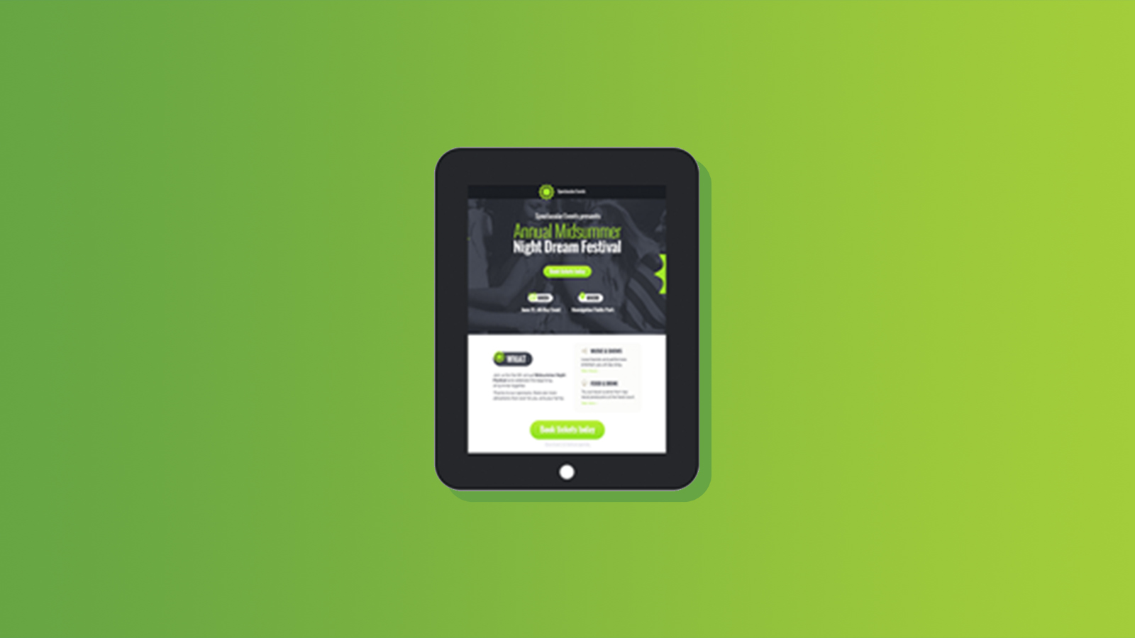
Take a look at an example from GetResponse on how a landing page SHOULD look on your desktop and your mobile.

If you are in the market for some responsive landing pages, check out Mashable’s 12 premium responsive landing page templates.
Ensure it’s a Compelling Offer
This seems like a painfully obvious element, but I see underwhelming offers on the reg. We are bombarded by digital advertising on a daily basis so if you want to stand out from the crowd, ensure you are offering something relevant, useful and valuable. If you offer something of value right away, this will help you differentiate yourself from your competitors and put you front of mind. Also, giving before getting builds trust and a relationship with your audience instead of just hitting them over the head with a sales pitch, win-win.
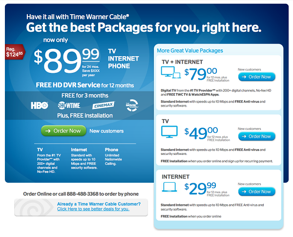
There are tons of offers you can give to reel in your audience and set up a quid pro quo. For example, a direct sale may not even be the purpose of your landing page, perhaps you just want to capture their email. In this scenario you could offer a special report, a whitepaper or a downloadable template. If the goal is a sale you could offer coupons, a discount or a bundle of features if they buy before a certain deadline. Check out the example from Time Warner below where they highlight not only a great discount but a bundle of features like HBO and DVR (Gimme, gimme!).
Use Visual Cues
You want to ensure that every step of your campaign and landing page is conversion-centered and one way to do this is by using visual cues. There are two types of visual cues you can leverage: Explicit and implicit directional cues.
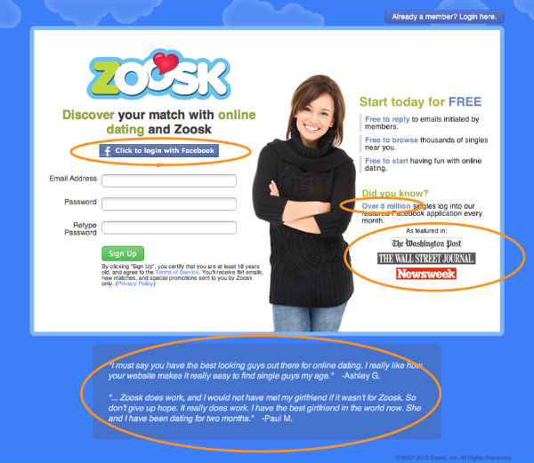
Explicit directional cues could be seen with fingers or arrows pointing to the CTA. They want your eyes to move to where the finger or arrow is pointing to move your attention to the form or CTA. An implicit directional cue is less direct, for example a person on the landing page looking at the CTA. This is a more casual and subtle visual cue but still will get the job done! Below is a great example of an implicit directional cue as the woman’s eyes push you toward the form.
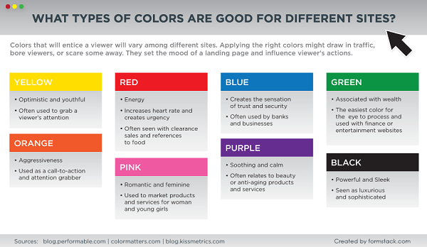
The size, shape, and color of your CTA button are a huge part of conversion psychology. That is why it is necessary to do your research (and test) to see which buttons will get you the most conversions. The first thing to consider when choosing your button is the color of the button itself. I could rattle off what emotion each color can elicit but instead, check out Formstack’s handy color guide below:
The shape of your button is another element you should consider when designing your CTA. Here are two critical elements to keep in mind: The brain doesn’t like sharp corners and rounded corners are easier for the brain to process.
Finally, size can play a factor in the success of your conversion rate. Wordstream reported that the bigger your button, the better. However, everything in moderation, folks! You want a button to be big enough that it catches your reader’s eyes, but you also want to ensure there is a good text to image ratio. The best way to figure out the right CTA size, color and shape is to test for yourself!
In this day and age, we’re constantly being marketed to, so we don’t take every product’s grand claim at face value. One way to show customers your company or product is the real deal is through social proof.
Picture this, you want to watch the newest movie that just came out on Netflix, but before you lose 2 hours of your life on a bad movie, you check out Rotten Tomatoes to see what other people thought of it. If the audience and critics gave it a good score, you watch it, but if it got a bad score you ditch it for an old classic instead. This is social proof in a nutshell, and you should use it on your landing pages because people may not believe your claim unless they hear it from other people too.
77 % of online shoppers use reviews to make a purchase decision so whether it is a testimonial a customer sent you through email or an awesome tweet singing your company’s praise, this is the closest you have to prove your product or company is legit!
Social proof doesn’t always have to be a review or testimonial from someone. It can also come in the form of the number of social shares on your blog, trust seals from other companies or the number of people subscribing to your company newsletter. The landing page below shows social proof splattered across the page to show potential customers that people feel positively about their product, so they should too!
Not a member? No problem, try out or email testing and web page previews free for 7 days!