Email Development
Easy Responsive Design Tutorial in 7 Steps
Oct. 20, 2015 Update: The technique covered in this blog (TD stacking) does not work with Android 4.4. For more information on this issue, read this blog.
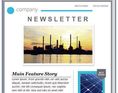
We’ve had a lot of questions about how to make a template responsive, and how responsive design works in general. Today, I’m going to take a template from 99designs (one that we wrote about in our 600+ Free Templates blog) and add responsive behavior to it so you can see how it’s done. If you don’t already have the template, go to their site and get it so that you can follow along. This blog is intended to illustrate how to apply responsive design to an existing template.
For this tutorial, I am using the “newsletter blue” template, called “NEWSLETTER BLUE.html.” You’ll want to open it up in a text editor, and save a new version of it that you’ll make responsive.
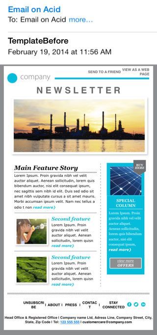
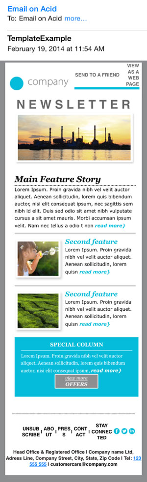
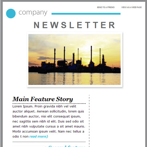
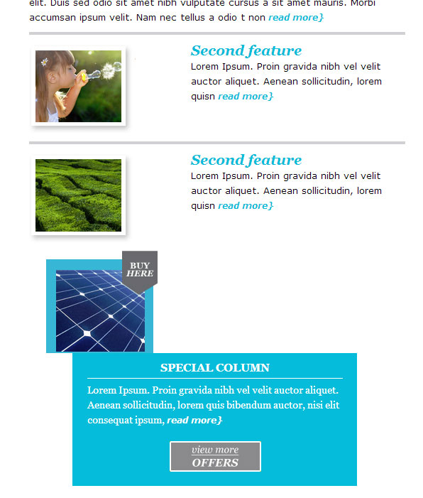
Check out our samples of this email before and after adding responsive design.
Without media queries.
With media queries.
1. Add a Style Block.
If you don’t already have a style block, you’re going to need one. This is where the media queries go, and that’s what is going to make your email responsive. A media query is a conditional statement that contains extra CSS rules to change the appearance of the email when the conditions in the statement are met. For this email, we’re going to use the same media queries that we used in our Responsive Template. You can check out the basic code right here:
                                <style type="text/css">
  @media only screen and (max-width: 640px) {

      }

  @media only screen and (max-width: 479px) {

      }
</style>
The first media query will trigger for screens of less than 640 pixels in width. The second query triggers for screens of less than 479 pixels in width. For more on min/max width, check out this blog. The query that triggers on smaller screens comes last so that it will take precedence over the earlier CSS rules in the block. We’re going to place our styles inside these media queries in the later steps.
Then we can add the attribute selector to each style in the media queries. You’ll see this in action in the next step.
2. Add the Yahoo! Fix.
This step is no longer necessary, as this was fixed by Yahoo.
3. Control the Width of the Container Element.
We need to control the width of the containing element, so that the email slims down to a single column on smaller devices. To start, let’s identify the parts of the email that determine its width. In this case, we’re looking at just:
<table width="600" border="0" cellspacing="0" cellpadding="0" bgcolor="#FFFFFF" align="center">
All we need to do is add a class to this table to control its width.
<table width="600" border="0" cellspacing="0" cellpadding="0" bgcolor="#FFFFFF" align="center" class="deviceWidth">
Now, we’ll add this class to our media queries:
                                  @media only screen and (max-width: 640px)  {
          .deviceWidth {width:440px!important; padding:0;}
      }

  @media only screen and (max-width: 479px) {
          .deviceWidth {width:280px!important; padding:0;}
      }
If you save your file and resize the window now, you won’t be able to see any changes. That’s because resizing the container element isn’t the only thing we need to do to make the email reach the correct width. Any image or table that is too wide for the new table width will cause it to stretch to accomodate the wider element. That’s why, in the next step, we’re going to need to apply classes to some of the images in this email to control their size as well.
4. Add New Classes to Relevant Images.
Some of the images in this email are so wide (more than 440 or 280 pixels wide, respectively) that they’re going to break out of the new sizes for the table that we picked in step 2. We’re going to add some special classes to help us resize them. For instance, in the email’s header, we have a long horizontal bar.
<td height="30"><img src="images/PROMO-GREEN2_01_04.jpg" width="393" height="30" border="0" alt=""/></td>
This bar is set to be 393 pixels wide, which will combine with the rest of the header to be too big. We’ll add another class here:
<td height="30"><img src="images/PROMO-GREEN2_01_04.jpg" width="393" height="30" border="0" alt="" class="deviceWidth2"/></td>
The featured image for the email is too wide, as is another image being used as a horizontal rule near the bottom. We’ll do the same thing for them, with a custom class. For example, the featured image:
<td align="center"><a href= "https://yourlink" target="_blank"><img src="images/PROMO-GREEN2_02.jpg" alt="" width="598" height="249" border="0"/></a></td>
Becomes:
<td align="center"><a href= "https://yourlink" target="_blank"><img src="images/PROMO-GREEN2_02.jpg" alt="" width="598" border="0" class="deviceWidth3"/></a></td>
Notice that we removed the height attribute. If we leave that height attribute, the image will look stretched to reach that height. On the other hand, if we don’t specify a height, it will automatically maintain its ratio. Now we’re going to change the size of these images in the media queries, like this:
                                @media only screen and (max-width: 640px)  {
          .deviceWidth {width:440px!important; padding:0;}
          .deviceWidth2 {width:300px!important; padding:0;}
          .deviceWidth3 {width:440px!important; padding:0;}
      }

  @media only screen and (max-width: 479px) {
          .deviceWidth {width:280px!important; padding:0;}
          .deviceWidth2 {width:200px!important; padding:0;}
          .deviceWidth3 {width:380px!important; padding:0;}
      }
When you resize the window, you should see the blue bar and horizontal rules get small enough to accomodate the new responsive behaviors. The email won’t get any smaller, though, because the table structure is still keeping it at the same size. In the next step, we’ll add a style to make the tables stack under each other.
5. Make some TDs Display:Block.
Most email designers use a table structure to create a “float:left” type effect for their content blocks. In this case, we have a sidebar on the right that will need to move under the rest of the content for the smaller views. Luckily for us, this is actually a pretty easy trick. We’ll just add a style to the containing TDs, in this case there are two of them. The TD containing the content on the left is width 58%, and the right side TD is width 35%.
                                <td width="58%" align="left" valign="top">
....lots of code in between here....
<td width="35%" align="left" valign="top">
Let’s add in the “block_td” class here.
                                <td width="58%" align="left" valign="top" class="block_td">
....lots of code in between here....
<td width="35%" align="left" valign="top" class="block_td">
Now we’ll add the CSS.
                                @media only screen and (max-width: 640px)  {
          .deviceWidth {width:440px!important; padding:0;}
          .deviceWidth2 {width:300px!important; padding:0;}
          .deviceWidth3 {width:440px!important; padding:0;}
          .block_td {display: block;}
      }

  @media only screen and (max-width: 479px) {
          .deviceWidth {width:280px!important; padding:0;}
          .deviceWidth2 {width:200px!important; padding:0;}
          .deviceWidth3 {width:380px!important; padding:0;}
      }
With this class, each of these TDs will display in its own vertical space instead of sitting side by side. They’re still constrained by the percent width listed inline, so we’ll have to overwrite that in the next step.
6. Fix Percent-Based TDs.
Now our two main content TDs look like this:
                                <td width="58%" align="left" valign="top" class="block_td">
....lots of code in between here....
<td width="35%" align="left" valign="top" class="block_td">
We’ll add another class to them to make them 100% width on mobile. I’m calling this class “percent_td,” but you can name it anything you like.
                                <td width="58%" align="left" valign="top" class="block_td percent_td">
....lots of code in between here....
<td width="35%" align="left" valign="top" class="block_td percent_td">
I am creating a new class because there are a lot more places you’ll want to use this in the email to make sure that all of these content blocks expand to full size in the mobile view. Now let’s add the CSS.
                                @media only screen and (max-width: 640px)  {
          .deviceWidth {width:440px!important; padding:0;}
          .deviceWidth2 {width:300px!important; padding:0;}
          .deviceWidth3 {width:440px!important; padding:0;}
          .block_td {display: block;}
          .percent_td {width: 100% !important;}
      }

  @media only screen and (max-width: 479px) {
          .deviceWidth {width:280px!important; padding:0;}
          .deviceWidth2 {width:200px!important; padding:0;}
          .deviceWidth3 {width:380px!important; padding:0;}
      }
Notice that we only need to add this style to the first media query, because anything that triggers the second query will also trigger the first. Our email is looking pretty good now! We do still have a few lingering problems to clean up.
7. Finishing Touches.
If you’ve been following these directions faithfully, you’ll see there are still a few problems. A remnant of the dashed border that separated the left and right columns can still be seen, as well as the image from the right column just floating in space. Let’s hide both of these things in the mobile view, to clean it up a bit. The following technique can be used to hide almost any element of the email that you don’t want to show on mobile, if applied carefully. Be wary of removing whole table rows or cells, as this can sometimes mess with the rest of the structure of a table.
This is the code that creates the border effect:
<td width="5%" style="border-right:2px dashed #95989a"> </td>
So we’ll add the “dashed” class to it. We’ll overwrite the border to 0 in CSS.
<td width="5%" style="border-right:2px dashed #95989a" class="dashed"> </td>
We’ll also add the “hidden” class to the image from the right column:
<td><a href="https://yourlink" target="_blank"><img src="images/NEWSLETTER GREEN03.jpg" alt="buy her" width="181" height="144" border="0" class="hidden"/></a></td>
Last, we need to reset the size of some percent based TDs that are now too big. We’ll set these to be 155px wide, slightly larger than the image they contain.
<td width="43%"><img src="images/NEWSLETTER GREEN01.jpg" width="150" height="130" border="0" alt=""/></td>
Becomes:
<td width="43%" class="pic_td"><img src="images/NEWSLETTER GREEN01.jpg" width="150" height="130" border="0" alt=""/></td>
Give each of the following TDs (with 57% width) the “percent_td” class so that they’ll occupy the remaining width of the row. And now the last bit of CSS.
                                @media only screen and (max-width: 640px)  {
          .deviceWidth {width:440px!important; padding:0;}
          .deviceWidth2 {width:300px!important; padding:0;}
          .deviceWidth3 {width:440px!important; padding:0;}
          .block_td {display: block;}
          .percent_td {width: 100% !important;}
          .pic_td {width: 155px !important;}
          .dashed {border-right: 0px !important;}
          .hidden {display: none !important;}
      }

  @media only screen and (max-width: 479px) {
          .deviceWidth {width:280px!important; padding:0;}
          .deviceWidth2 {width:200px!important; padding:0;}
          .deviceWidth3 {width:380px!important; padding:0;}
      }
That’s it! You should now have a pretty good looking responsive email template. Of course, you’ll probably want to tweak some of the padding and a few other details to really add some polish to it. I hope this tutorial has helped you understand how responsive design works, and how easily it can be applied to any template! Here are those samples again, so that you can see how well you’ve done.
Without media queries.
With media queries.
Extra Credit
Hide the table cells on either side of the “special column” using the “hidden” class (in the final sample of the media query, above), to make it extend to the width of the screen. You should always test carefully when hiding cells, as it may break your table. In this case, my testing showed that it would still look good in all clients. You might also want to do some work on the footer and header text, as the links look pretty jumbled now. Controlling the appearance of these sorts of things is the final “polishing” step of getting a perfect email for mobile clients.


