

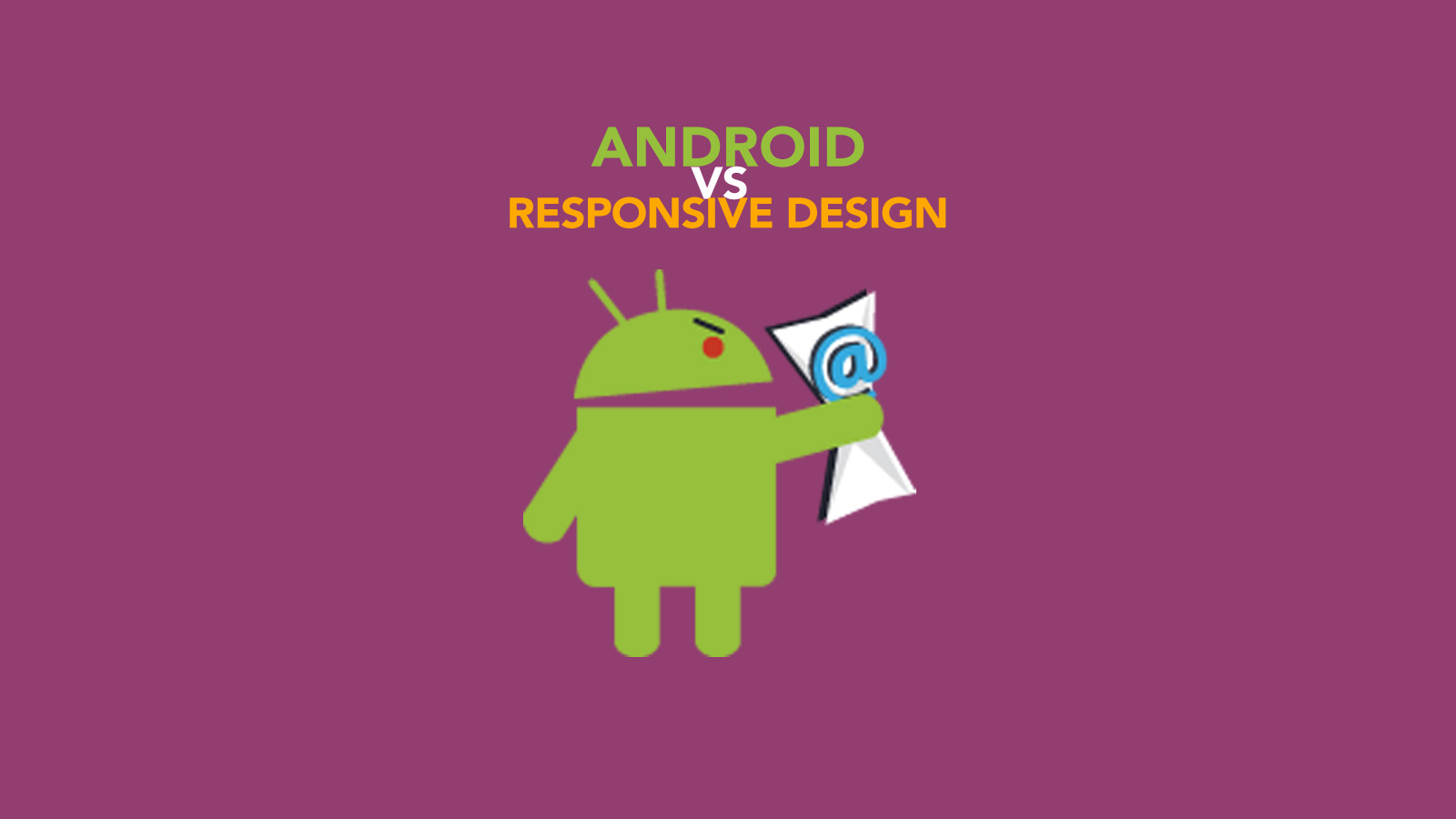
How Android is Strangling Responsive Design
The Question
“Are you kidding me? Android must support responsive design. Right? Right??”
Hold your horses there, kemosabe. I did a little testing and found out exactly what was going on. It’s easy to assume the days of non-responsive Android clients (like 2.1) are behind us, but after I wrote a blog on how to make an email template responsive, I found out that it’s not so simple. In the comments, many of our readers were curious as to why the code was or wasn’t working for Android phones. It turns out the answer to this question is actually pretty complicated.
Let’s start by covering two of the most popular techniques for turning a multi-column design into a single column design on mobile: stacking TDs or stacking tables. Both are very similar, in that they use a table structure to create the two column layout. Tables/TDs with align are used instead of float because many email clients don’t allow floats to work. These methods had been used relatively interchangeably until recently.
Code Sample
<!DOCTYPE html PUBLIC "-//W3C//DTD XHTML 1.0 Strict//EN" "http://www.w3.org/TR/xhtml1/DTD/xhtml1-strict.dtd">
<html>
<head>
<style type="text/css">
td {border: 1px solid red;}
@media only screen and (max-width: 479px) {
.td_align {display:block;width:100%;}
.table_align {display:block;width:100%;}
}
</style>
</head>
<body>
<p>This design is built with two TDs that should become display block.</p>
<table width="300">
<tr>
<td align="left" class="td_align">
Left
</td>
<td align="right" class="td_align">
Right
</td>
</tr>
</table>r
<p>This design is built with two tables which are "aligned" and become block.</p>
<table width="300">
<tr>
<td>
<table align="left" class="table_align">
<tr>
<td>Left</td>
</tr>
</table>
<table align="right" class="table_align">
<tr>
<td>Right</td>
</tr>
</table>
</td>
</tr>
</table>
</body>
</html>
The Problem
The TD stacking method shown above actually depends on having the correct doctype. If the doctype is not included in the email’s code, both of the TDs will remain on the same row instead of stacking. This is where the versions of Android become relevant. The TD stacking method works just fine in Android 2.3 (Gingerbread) and in 4.0.3 (Ice Cream Sandwich), the Android versions we offer testing in. However, in Android 4.4 (KitKat) the native mail client strips out the doctype before displaying the code. This causes the problems I listed above. Fear not, Android 4.4 is on our roadmap to add to our testing suite as soon as we can.
Check out the pic below to see how the table and TD stacking methods (with and without doctype) render in the different Android versions as well as iOS. You can see that without the doctype, the TD stacking method doesn’t really work. Both of the TDs are still in the same row. In Android 4.4.2, the TD stacking method doesn’t work in either case because the doctype is stripped. The table stacking method works in all cases, though some additional CSS would be needed to make the stacked tables take the full width of the phone.
The Solution
Of these two methods, we recommend the table stacking method because it does not depend on having a doctype to function. To summarize market share/support:
- Gingerbread(2.3) – 2% mobile/tablet market share – TD and Table stacking supported.
- Ice Cream Sandwich(4.0) – 2.5% mobile/tablet market share – TD and Table stacking supported.
- KitKat(4.4) – 17% mobile/tablet market share – Table stacking supported. Doctype stripped, TD stacking not supported.
- iOS(All) – 43% mobile/tablet market share – TD and Table stacking supported.
As pointed out by Steven in the comments below, you can also change your TDs to THs to fix this issue.
Android Lollipop is Coming
Android’s version 5.0, or “Lollipop” is on the way, though currently they only have about .7% of the market share. As reported elsewhere, Lollipop will not have a stock email client (though it may have one added by the manufacturer). Instead, it instructs users to download the Gmail app. The Gmail team recently added the ability to connect the Gmail app to other kinds of mail accounts, including Outlook.com, Yahoo! Mail, Exchange and so on. While consolidating their mail apps is good for Google, it may not be so good for the rest of us. Gmail still doesn’t support media queries, meaning that neither the table stacking method nor the TD stacking method will work. Unless a Lollipop user downloads a more responsive design friendly app, they’ll be seeing the worst looking version of your emails possible. As we watch the market share of Lollipop grow, marketers will have to turn to one of two things: hoping that Gmail gets with the times, or other design techniques.
Are your emails looking their best?
Check out our 7 day free trial and start testing today! We’ll help you find out if your email is click-worthy, or hard to read and easy to trash.
Are you guys going to update (or create another) EoA responsive template that uses the table stacking method instead?
Table stacking method is ok. But what about the styling of individual elements? For example, reducing the font size of the title on Android.
It also seems that the gmail app on Android is defaulting to a zoomed in view, really messing up the layout, killing padding on table cells, etc. If this becomes the default email app for Android, it’s a huge problem, and client expectations will need to be reset. Even gmail on iPhone is now defaulting to a “mobile optimized” view with the option to click to the normal desktop view. Their mobile optimized view enlarges fonts and messes up the layout.
So, gmail is even more problematic than you mention above. If you would consider putting out some more documentation on this, that would be most helpful as I try to convince my clients to be aware of these limitations.
Thanks so much, don’t know what I’d do without Email on Acid!
-Elliot Grossbach
I just don’t understand why it’s so tough for companies like Google to get board with this. In Lollipop, they’re basically going to make you download a mobile app that shows you desktop emails..really? The modern smart phone has been around for almost a decade and this is where we are?
Ironically, I originally read this article-which is not responsive— on my phone, and basically experienced all of the same pain points as someone attempting to read email on the Gmail app.
Not sure how much compatibility everyone here is aiming for, but we litmus test all our emails in ReturnPath against a rather large list of clients & devices. As a rule of thumb, you shouldn’t be using padding or margin in your emails. Instead use a cell to push or a spacer image…sucks, I know but if you want the most consistent results across the board, this is how you get it done.
To make matters worse, Gmail on Android is now scaling your emails to fit to the viewers screen and this can result in broken designs, where it puts unwanted space between images – even with display:block; in place. If you are seeing this, it is because the gmail client on android is now ignoring your media queries and displaying your largest/desktop size and scaling it to fit. Unfortunately, it fails to calculate a new height for a cell…so if you are one of those who declares a cell height, you will want to stop doing so.
Want proof? Create an email with a bunch of images stacked up and declare a cell height on each cell. You will see a gap in between those images on the newer versions of gmail on android. Now rotate the phone between landscape and portrait and watch that gap get smaller as the viewing area gets wider.
@pixilated44
Only thing I’d mention is that padding on table cells is actually very well supported. Only quirk is in Outlook 2007/2010/2013, if you add padding on one cell to the top or bottom, an adjacent cell will inherit that same padding, in which case there are fairly simple workarounds.
The Gmail zoom on Androids is indeed a killer.
Thanks for the article. I knew about the lack of support in Android 4.4 but didn’t know it was due to stripping out the DOCTYPE.
I did note a difference too in how an email can display in the gmail app depending on what webmail you use:
I have both an Outlook (something@hotmail.com) and a Gmail account (something@gmail.com) set up in the Gmail app. The same email will render differently, adding yet another layer of complexity.
Someone mentioned not using padding in emails; I use padding but only on table cells (
Gmail app doesn’t support media queries, but it tries to do a pseudo-mobile layout with the code I develop. So to prevent this, I add a hack to force the email to render at “full width”:
WebDevJoshB,
Yes, it can be very complex. We blogged about another version of that fix (for Gmail app) here: https://www.emailonacid.com/blog/details/C13/android_gmail_app_and_inbox_app_still_increasing_font_size
@Brandon DeWeese,
Sorry about the blog not being responsive! We are working on fixing that in the next iteration of our site.
Is there any way we can try and convince google/Gmail to support media queries – people power right?
Hi Geoff,
Im finding problems with table stacking in outlook 2007/2010. The tables align left and right but they render on seperate rows rather than next to eachother.
Any ideas?
Pete
Pete,
This can be caused by all kinds of things! I would grab our Outlook guide and start there.
https://www.emailonacid.com/blog/details/C13/tips_and_tricks_outlook_07-13
Pete,
Try dropping this directly in between your 2 tables…
<!–[if mso]>
Hi Pete,
The widths of the tables that are aligned left and right have to add to slightly less than 100% of the container’s width in order for them to appear side-by-side; even if they have no border, tables has like 2px added to their widths.
I will usually set the tables to 49% to accommodate. Or I’ll do 50% and set the tables’ widths to 49% in conditional CSS for outlook (if mso…).
Hope that helps.
The table aproach doesnt work very well for Gmail.
For desktop view you need to align one table to the left and other to the right, it stacks on gmail but the elements inside the first table will be obligatory aligned to the left and in the second table aligned to the right.
Any workarounds?
@Eduardo, I gave up on trying to stack left and right tables individually, just use one table with 2 columns. You can break those 2 columns down for mobile @320px or whatever width you like to use and apply the following CSS which will make the right column break under the left column:
1. display block !important
2. clear both !important
3. float left !important
@Brandon DeWeese,
Excellent points!
Hey All! Here is an alternative. We can use the
<style>
table th { margin:0 !important; padding:0 !important; vertical-align:top; font-weight:normal; }
@media only screen and (max-width: 640px) {
*[class].block { display:block !important; }
}
</style>
I sometimes see @media queries with max-width: 479px and sometimes with max-width: 480px. Which one is best to use and why? For 640px it always seems to be max-width: 640px, never 639px.
Martijn,
Max-width basically translates to, “If [device width] is less than or equal to [specified #], then do {…}”
For more on this, check out our blog on media queries: https://www.emailonacid.com/blog/article/email-development/emailology_media_queries_demystified_min-width_and_max-width.
As far as what devices are 480px vs. 479px, I am not sure. I would say that it’s safest to use 480, as that will also include devices that are 479px wide.
Steven,
OMG! Can’t believe just changing all
Won’t help on Gmail though but lets just hope they fix the Gmail app soon….
@steven th solution is great, thank you.
@steven Thank you so much!
Hi, I write because I have problems when testing Android Gmail … By analyzing the code throws me the following error discrepancies : STYLE STYLE declaration not supported in HEAD tag .
Line : 4 <style class = “text / css” >
I tested omitting style and all of its code , yet the disadvantage of testing under this email provider persists. How can i fix this?
jgarciag,
That’s right, Gmail doesn’t support most styles in the head tag. Removing the styles from the head will make little difference, as Gmail is already ignoring most of them. Your problem is probably not in the head of the email, but in the inline styles. Have you tried using a CSS inliner before testing?
@steven amazing thank you Sir 🙂
The TH method works fine.
Thank you so much for this awesome hack!
It saved me a lot of time!
Hot DAMN, Steven! The TH trick WORKS! Thank you loads!
TH Trick works! THANKS!