Email Development
Code a Responsive HTML Email Template in 3 Simple Steps

You’ve got a smartphone, and you know exactly how it feels when a digital experience isn’t optimized for mobile. It could be a webpage, an application, or an email. That frustrating feeling of not being able to navigate, read the text, or click a button is enough to make you chuck a brand-new iPhone across the room.
People have been checking their email on mobile devices for decades, yet developing mobile-friendly emails remains a challenge for many senders.
Sinch Mailjet’s report on email engagement found that 71.5% of consumers say they primarily check their email on a mobile device. That’s why we strongly encourage taking a mobile-first approach to email development.
No matter if you are a B2B or B2C company, your emails need to look their best and function properly on both desktop and mobile. That’s why in this article, we’ll give you the information and code snippets you need to code your own responsive HTML email template.
What makes an HTML email responsive?
Mobile responsiveness refers to the capability of an email to adapt its layout and content dynamically across various screen sizes and devices. This ensures that emails are readable and function correctly on smartphones, tablets, laptops, and desktops.
Depending on the size of the screen on which a subscriber is viewing your email, you can code things so that the size of the text, number of columns, size of images, and other factors adjust accordingly.
Responsive HTML email design ensures your campaigns are not only easy to read but also easy to engage with. Your subscribers can avoid excessive zooming or scrolling and instead view the email in a way that’s ideal for the screen they’re staring at. This delivers an acceptable user experience and ensures your engagement rates don’t plummet.
Emails that are not responsive will always perform far worse then those you’ve optimized for mobile. If people can’t read it, they won’t get the message. If they can’t click, they probably won’t convert. If the layout is a hot mess, it’s going straight in the trash – because the cute garbage-can-shaped delete button in their email app is definitely optimized for mobile.
Mobile-Responsive vs. Mobile-Friendly vs. Fluid-Hybrid Emails
What’s the difference between a responsive email and one that’s mobile-friendly? Where do fluid-hybrid emails fit into the picture? You may hear these three terms used when discussing ways to optimize emails for mobile. Here are some quick explanations to clear things up…
Mobile-responsive emails: These typically use CSS media queries to adjust the email layout based on the device’s screen size. This method ensures that the email looks great on all devices by dynamically changing its structure.
Mobile-friendly emails: Designed with mobile users in mind, these emails are generally simpler and use larger fonts and buttons but do not adjust to different screen sizes dynamically. The key difference is that you can code and design an email for mobile, but that doesn’t make it responsive.
Fluid-hybrid emails: This is a way to develop responsive HTML emails with minimal use of media queries and breakpoints. Instead, fluid-hybrid coding involves using percentages for widths so that elements of the email expand to fill the screen. A max-width media query is still used to limit how much things expand on larger, desktop screens. This is a more advanced approach, but it also an effective and consistent way to develop emails. Check out Nicole Merlin’s guide for some expert advice.
In this article, we’ll explain how to build a responsive HTML email template using min-width media queries. Doing it this way, rather than using max-width, means you code for mobile first and expand the layout for larger screens.
3 steps to create a responsive HTML email template
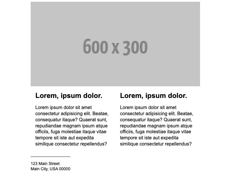
Let’s start looking at the code you’ll need to build a responsive HTML email template. We asked Megan Boshuyzen to show us how she’d develop a mobile-first email that expands to two columns on desktop.
Of course there’s more than one way to do it. But if you need an easy (and dare we say lovely) way to code a responsive email, this is all you need.

1. Start with HTML <table> structure
Begin with a clean, table-based layout, which is widely supported across email clients. Use nested tables to control the structure and layout of your email content. Using <div>s instead of <table>s is also a valid way to approach this. However, we’re using tables in our tutorial to make sure your template works in desktop versions of Outlook.
For more on the email geek debate over tables vs divs, check out a fun “Battle of the Devs” between Megan Boshuyzen and Anne Tomlin at Parcel Unpacked.
                                <table class="container" role="presentation" width="600" cellspacing="0" cellpadding="0" align="center" style="border-collapse:collapse;max-width:600px;width:100%;">
	<tr>
		<td align="center">
            <!-- Email content goes here -->
        </td>
    </tr>
</table>
Don’t forget to set the table role to presentation (role="presentation"). This makes your email more accessible because screen readers will know the <table> is being used for layout purposes and not to display data.
2. Add your mobile styles first
Many people still use a max-width media query to code emails for desktop first and then apply mobile styles for smaller screens. We recommend flipping that process on its head and starting with code for mobile.
Megan often points out that coding for desktop first requires more code. Plus, when you use a min-width media query for responsive email design, if your desktop styles don’t work, the design will still look fine. You can’t say the same for how desktop styles display on mobile.
Here’s code that makes mobile styles the default in a responsive HTML email template:
                                <style type="text/css">
    body, table, td, a {
        -webkit-text-size-adjust: 100%;
        -ms-text-size-adjust: 100%;
    }

    body, html {
        margin: 0;
        padding: 0;
        width: 100% !important;
    }

    h1, h2, p, a {
        font-family: Arial, sans-serif;
        line-height: 1.3;
    }

    img {
        max-width: 600px;
        width: 100%;
        display: block;
    }

    .container {
        width: 100%;
        padding: 10px;
    }

    .content {
        display: block;
        padding: 1em;
    }

    h1, h2 {
        margin: 0;
    }
</style>
Be sure to use display:block; for the content in your columns. This ensures email elements in the table layout will stack on top of each other for mobile viewing.
3. Add your desktop styles
Here’s where the media query comes into play. Once again, we’re using a min-width media query so that, beneath the hero image, our mobile styles expand into two columns for desktop.
Basically, what a min-width media query does is define what to do when a device’s width is greater than the breakpoint. We’ve set the breakpoint below to 600px, which is an ideal width for most mobile phones as well as tablets.
                                @media only screen and (min-width: 600px) {
    .container {
        width: 100% !important;
        max-width: 600px !important;
        margin: 0 auto !important;
        display: block !important;
    }


    .content {
        width: 50% !important;
        font-size: 16px !important;
        display: table-cell !important;
    }
}
For desktop styles, you’ll need to change display:block; to display: table-cell; in the media query. This makes it so the content expands to two columns. Of course, setting the content width to 50% ensures what’s in the two columns fits neatly side-by-side.
You can also use media queries to make other enhancements for mobile or desktop viewing. That includes resizing images, adjusting text size, and modifying the email’s padding and margins for certain viewports.
If you ever need to target a range of screen sizes or a specific device, like a smartwatch for example, you can use both min-width and max-width media queries.
The complete code for a responsive email template
Finally, here’s a look at all the code you’d use to build exactly what we showed you at the start. You’ll need to customize this code to meet your needs. That includes adding your own font stack for email, replacing the placeholder image, as well as updating the information and links in the email footer.
                                <!DOCTYPE html>
<head>
	<title>Responsive Email</title>
	<style type="text/css">
		body, table, td, a {
			-webkit-text-size-adjust: 100%;
			-ms-text-size-adjust: 100%;
		}

		body, html {
			margin: 0;
			padding: 0;
			width: 100% !important;
		}

		h1, h2, p, a {
			font-family: Arial, sans-serif;
			line-height: 1.3;
		}

		img {
			max-width: 600px;
			width: 100%;
			display: block;
		}

		.container {
			width: 100%;
			padding: 10px;
		}

		.content {
			display: block;
			padding: 1em;
		}

		h1, h2 {
			margin: 0;
		}

		@media only screen and (min-width: 600px) {
			.container {
				width: 100% !important;
				max-width: 600px !important;
				margin: 0 auto !important;
				display: block !important;
			}


			.content {
				width: 50% !important;
				font-size: 16px !important;
				display: table-cell !important;
			}
		}
	</style>
</head>
<html lang="en">
	<body>
		<div lang="en" dir="ltr" style="padding:0; margin:0;">
			<table class="container" role="presentation" width="600" cellspacing="0" cellpadding="0" align="center" style="border-collapse:collapse;max-width:600px;width:100%;">
				<tr>
					<td align="center">
						<h1><img src="https://fakeimg.pl/600x300/" alt="" width="600" /></h1>
					</td>
				</tr>
				<tr>
					<td>
						<!--[if mso]>
						<table role="presentation" align="center" width="600" border="0" cellspacing="0" cellpadding="0" style="border-collapse:collapse;">
							<tr>
								<td>
						<![endif]-->
									<table role="presentation" border="0" cellspacing="0" cellpadding="0" style="border-collapse:collapse;max-width:600px;width:100%" width="600">
										<tr>
											<td class="content">
												<h2>Lorem, ipsum dolor.</h2>
												<p>Lorem ipsum dolor sit amet consectetur adipisicing elit. Beatae, consequatur itaque? Quaerat sunt, repudiandae magnam ipsum atque officiis, fuga molestiae itaque vitae tempore sit iste aut expedita similique consectetur repellendus?</p>
											</td>
										</tr>
									</table>
						<!--[if mso]>
								</td>
							</tr>
						</table>
						<![endif]-->
					</td>
				</tr>
				<tr>
					<td>
						<table role="presentation" cellspacing="0" cellpadding="0" border="0" width="600" align="center" style="border-collapse:collapse;">
							<tr>
								<td class="content" style="border-top:thin solid #000;">
									<p>123 Main Street<br />Main City, USA 00000</p>
									<p><a href="#">Unsubscribe</a></p>
								</td>
							</tr>
						</table>
					</td>
				</tr>
			</table>
		</div>
	</body>
</html>
A responsive email template like this could be modified for a newsletter that showcases your articles in two columns on desktop and stacks everything for mobile. It could also be useful for an email featuring multiple products and descriptions or for an email listing speakers and bios at a webinar or live event.
Test your responsive email templates before you hit send
While you can fire off a test email to a few colleagues to see if your responsive emails respond as expected, there are better ways to find out if they look good on mobile devices.
Sinch Mailgun Inspect gives technical users a detailed look under the hood, catching broken links, missing headers, and rendering issues before they cause problems. It leverages the same industry-leading rendering engine behind Email on Acid, built into the Mailgun platform.
Meanwhile, Sinch Email on Acid remains a top choice for marketing teams focused on visual QA. Use it to see previews of how your email renders on more than 100 clients and popular devices like iPhones and Google Pixels.
As a complete pre-send email testing platform, Email on Acid also includes tools for checking deliverability, validating images and URLs, and testing email accessibility. Take advantage of a 7-day free trial to see how it can help you put your best email forward.