Email Development
Viewport Metatag Rendered Unusable

Email Development
In our responsive design testing, we’ve been trying a number of different techniques to control how our emails are displayed. One tempting piece of internet technology was this little line of code:
<meta name="viewport" content="width=device-width, initial-scale=1.0, maximum-scale=1.0," />
The example above does a few different things, in theory. Using width=device-width tells the browser or email client to assume that the page is as wide as the device. By adding initial-scale=1.0 you specify that the browser shouldn’t zoom in or out on your content when it first displays it. Last, maximum-scale=1.0 should prevent users from zooming in or out. Sounds pretty useful, right? Sadly, browser support for this metatag is spotty, and email client support is even worse.
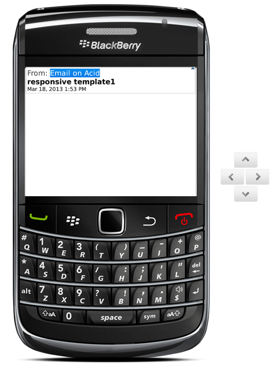
We tested the above properties of this metatag in a few different mobile clients to see how well they abided by its rules. We found a surprising amount of disparity between the clients, and one client that displayed nothing. That’s right, the Blackberry will display a blank white page if you include the viewport metatag.
| Device | Allows zoom by default | Initial-Scale | Maximum-scale | Notes |
| Android | Initial-scale seems to block the user from zooming out. Without the initial-scale, users can zoom out to aprox .5X. With and without the meta tag, it scaled up to the same max dimension (aprox. 2X). Seems like maximum-scale isn’t supported. | |||
| iPhone | This device operated the same regardless of viewport settings. Its max zoom is much higher than the Android (aprox 5X) | |||
| Kindle Fire | Setting the initial-scale and max scale to 1.0 basically disables the zooming functions for this device. Setting the max scale controls the max zoom in and the max zoom out. | |||
| Xoom | Setting the max scale to 1.0 basically disables the zooming functions for this device. Setting the max scale controls the max zoom in and the max zoom out. This device did not respond to media queries with the meta tag | |||
| iPad | This device operated the same regardless of viewport settings. It’s max zoom is much higher than the Android (aprox 5X) | |||
| Blackberry | — | — | — | Emails that are sent with <meta name="viewport" content="..." /> and anything in the content attribute appear to be blank when viewed on BlackBerry. |
Does this mean that the viewport tag is useless? As far as we can tell, yes. We tried testing a number of different things with the Blackberry to see if it would accept the viewport tag, and all tests failed. We tried using the deprecated “HandHeldFriendly” tag:
<meta name="HandheldFriendly" content="True" />
We hoped the Blackberry would accept the viewport tag after HandHeldFriendly, but that didn’t help. We tried using fixed dimensions for the viewport tag, with no success. Because of this, as well as problems in other clients, it is our recomendation that those who want their email to be readable on a Blackberry (pretty much everybody) should not use the viewport tag at all.
If you’ve found a way to get past this limitation, please let us know!