Email Development
6 Simple A/B Tests to Optimize Your Conversion Rate

The new “it” couple: Marketing and A/B testing
As digital marketers, we can no longer rely on JUST our intuition when deciding what will resonate with our audience. Instead, we need hard facts and in-depth analytics to point us in the right direction for the best conversion optimization — and that’s where A/B testing comes into play.
So what is an A/B test? A/B testing is a simple way to test your current design (A) against changes to your page/email/ad (B) and determine which one produces the most positive results. This technique can be used to make sense of metrics such as sign-ups, downloads, purchases, and so on, to identify which version will increase or maximize an outcome of interest. Of course, one can test more than two versions at a time.
A simple tweak in your email campaign or website could significantly increase your bottom line; that’s why testing MUST be your #1 priority. Grab this list of 6 simple A/B tests you can implement in your next marketing endeavor to ensure you are getting the most bang for your buck:
Split testing can vary in its complexity and results but if you are new to the world of A/B testing, my advice is to start with the good ol’ subject line test. A/B subject line tests are simple in nature, but can be wildly effective. According to WPCurve, a simple A/B subject-line test they did yielded an increase of 28% in clicks!
It is important to note that when A/B testing subject lines, there should be a method to your madness. Don’t simply plug in two different subject lines and hope that one will do better than the other. You should test subject lines that execute a distinct hypothesis that will educate you for future campaigns. For example, you can try testing capital vs non-capital letters, spelled out numbers vs numerical numbers, different offers, or just change around the wording. The world is your oyster!
For example, take a look a test a company called Email Aptitude ran when promoting free shipping for a shoe sale. Both subject lines mentioned that there was free shipping but the second subject line gave a deadline for when the promotion would expire. This simple tweak made a 5.25% difference in the open rate which can make or break a campaign.

If you went through the effort of creating a killer subject line and compelling content, it is an EPIC fail if you forgot to A/B test your “call to action.” Your CTA is the most important part of your email and it’s a crying shame if you aren’t optimizing it through your tests.
A company called Friendbuy is great example of how you can QUADRUPLE the number of visitors who interact with your product, just by testing your CTA. Friendbuy had initially made their homepage CTA overcomplicated and were seeing only a 1.44% CTR.

Friendbuy saw the need for A/B testing and formulated two other variations of their CTA that were direct, clear and uncomplicated. Friendbuy replaced the original banner with a 50/50 rotation of the two new versions to ensure their results were legitimate.
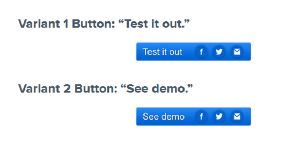
Below are the results:
- Baseline (original) CTR: 1.44%
- Variant 1 CTR: 2.47% (71% improvement over baseline
- Variant 2 CTR: 4.49% (82% improvement over variant 1, and 211% improvement over baseline)
In this case, the results clearly show which CTA resonates the most with their audience. CTA’s should be clear and simple. A prospect should never question what their next step is to learn more about your company.
A great number of companies come to a crossroads when they ponder whether a free trial is right for their company. When making this decision, the question that always comes to mind is, “Will it decrease the paid signups?” GetResponse, a leading email marketing platform, created some pretty solid stats on this subject. Let’s take a look.
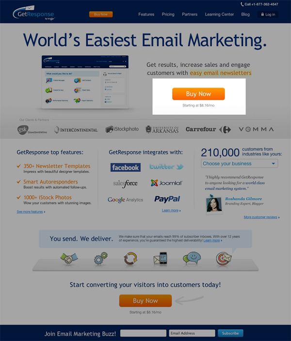
GetResponse wanted to add a “Free Trial” button on the home page. The goal of the experiment was to see if adding a “Free Trial” would have any effect on the number of purchases of paid accounts. They also wanted to know if this change would affect the number of free accounts registered. They used Visual Website Optimizer to create an A/B test in which the control page only had a “Buy Now” button. The variation page had an extra “Free Trial” button next to the “Buy Now” button. Check out their two homepages below:
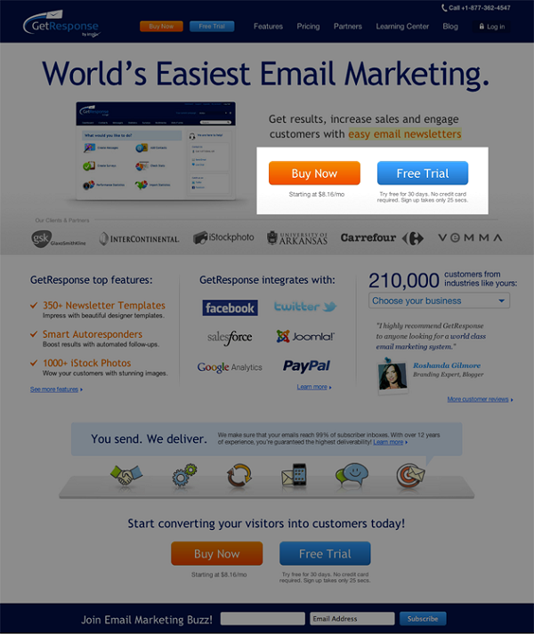
This is a screen capture of GetResponse’s test results from Visual Website Optimizer.
The results were astounding because the number of free accounts increased by 158.60%. On top of that, they were also able to prove that offering a free trial did NOT have a negative influence on the number of paid accounts created via the homepage. So what the heck are you waiting for?! Offer your prospects a free trial if you haven’t already.
We already touched on offering a free trial for your company (all signs point to “yes”); however, it is important to figure out what kind of “free” trial will convert better for your specific brand. Believe it or not, all free trials are NOT created equal.
When creating your free trial, will you require a credit card upfront or ask for the credit card later?
Totango, a customer engagement management platform, dug deep into this question by studying which kind of trial will convert more prospects into customers for SaaS companies. Totango set up two different pages, one that required a credit card to receive a free trial and one that did not. They surveyed a pool of 20,000 visitors and divided the traffic equally between both pages. The results are below.
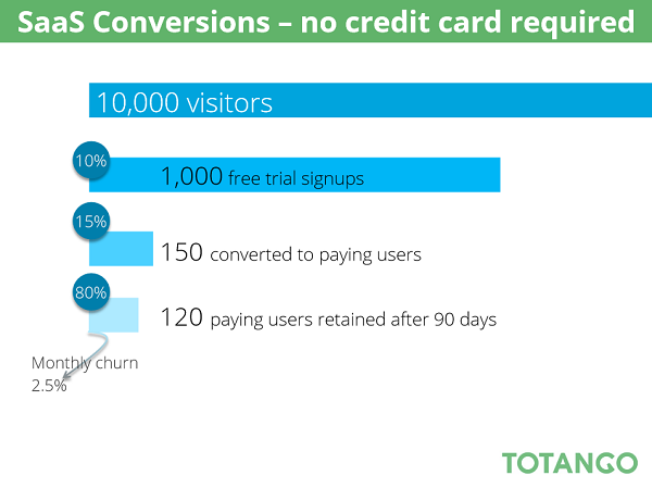
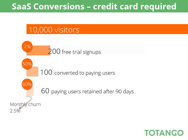
This is a screen capture provided by Totango.
You can interpret this data on many different levels depending on what your goals are. In this instance, the lifetime value of the customer was my main goal when I looked at these trials. Looking at the conversion comparisons after the first 90 days, the trial with NO credit card required outperformed the trial that required a credit card down. Based on these results, if Totango is looking for new clients to stick around for the long-haul, then they should offer a free trial without a credit card required.
Your audience makeup may be quite different from the visitors surveyed in this study, so be diligent with your testing before your make a final decision.
When formulating the CTA for a single campaign, most marketers usually settle on one offer and one goal. Mix it up this time and try testing entirely different offers to figure out what your audience believes is your company’s most enticing offer. For your next campaign, instead of settling on a single promotion, come up with a second one (or three or four!) and test those offers against one another to see which one is more appealing to your subscribers.
For example, do your customers respond most favorably to a time sensitive discount, a percentage off, a dollar amount off, free shipping, a discount limited to specific products, a flash sale, or something completely different? An online cookie store named Smiley Cookie asked this very question when they teamed up with Trinity Insight in order to increase their sales and conversions.
Trinity Insight wanted find out what value prop Smiley’s audience found most enticing so they tested the 5 following offers on Smiley Cookie’s site:
- Order Today -> Ships Next Business Day
- Want to save $5 OFF your next purchase? SIGN UP NOW
- 6.99 Ground Shipping For Your Entire Order
- FREE SHIPPING on any order over $40
- Cookies Made Fresh & Hand Iced For You!
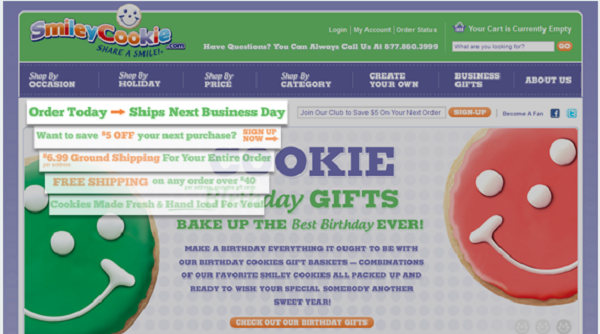
This is a screen capture gathered from Trinity Insight’s segmentation tools.
While the test was running, the overall conversion rate for the site was 8.98% with an average order value that was $29.85, yielding a $2.68/per visit value. Over this same period of time, the winning creative, Order Today -> Ships Next Business Day, had a 12.61% conversion rate and a $29.95 average order value resulting in a $3.78/per visit value. This represents a 41% increase over the site average! When creating an A/B test for entirely different offers for your company, really think about your main value proposition. In the example above, the people visiting Smiley Cookie were probably buying the cookies as a gift for someone else and time was of the essence, not the price. That’s why the next day shipping worked best for their business model.
Use the magic of A/B testing to uncover your audience’s motivation with this test.
Even though talking about forms and fields may not be the sexiest aspect of marketing, forms are crucial to the success of your business. Forms are where visitors sign up, leads are generated, and sales are transacted. You can ALWAYS improve your form’s performance but I do have a word of caution: no one likes being asked too many questions! Bigger isn’t always better in the world of forms and the general rule of thumb is to keep them as short as possible. This may be hard to hear because you don’t want to let go of all that extra collected customer information, but this tactic will help in the long run for forms, leads, and sales conversions. Check out the study below if you don’t believe me…
A case study was conducted by Attacat Internet Marketing for a company called Flying Scot Parking that operates car parks. Attacat immediately saw an opportunity to streamline the booking process and increase conversions by removing unnecessary fields. Check out the difference of the forms below.
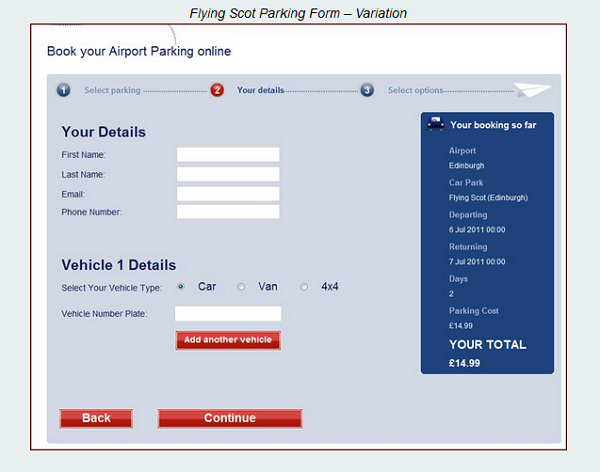
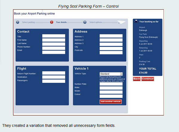
This is a screen capture from Attacat Internet Marketing’s findings.
Flying Scot Parking saw a 45.45% increase in visitors moving to the next step and 35% increase in form submissions from this simple tweak. Flying Scot could conclude that their conversions increased because of fewer form fields. Eliminating unnecessary form fields will create less friction for your prospect when going through the process. Know what the goal of your form is beforehand so you can remove the superfluous fields and keep the crucial elements. Moral of the story: Less is more.
What is the statistical significance of your test?
”Statistical significance” isn’t asking if your results were important or meaningful to you. Instead, this term coincides with another A/B testing term called “confidence level.” The confidence level is the probability that the measured conversion rate differs from the control page conversion rate for reasons other than chance alone.
You should have a confidence level of at least 90-95% before you can determine that your results are statistically significant. For example, if you had a very low response to an email campaign sent out the day before Christmas, you should consider that the holiday may have negatively impacted your email open rates. Numbers are important, but you must also be able to analyze the numbers logically to gain a conclusive summary of the results. Quality trumps quantity any day of the week in A/B testing. If in doubt, run the test again to validate the results!
If all these numbers, stats and graphs are frying your brain, don’t worry! We’ve got you covered. Grab this A/B calculator to be confident that the changes you made have really improved your conversions. Happy testing!