Email Development
A Slick, New Image Swapping Technique for Responsive Emails

Switch Hitter
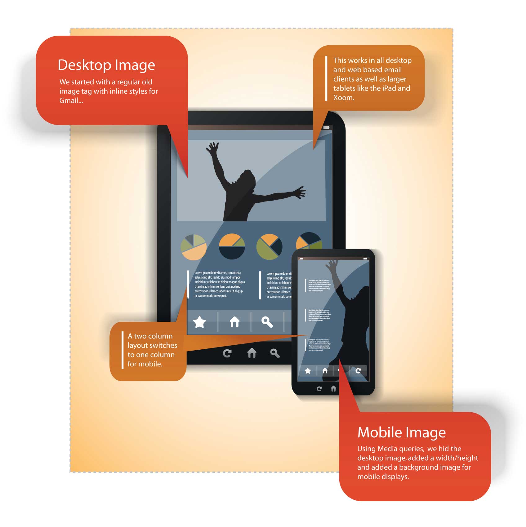
Being able to switch images for mobile is a handy trick to have for a number of reasons. You can use it to show a cropped version of an image for mobile users or show one offer to desktop users and another for mobile users.

Check out the code for our bulletproof image switch below. This swap should work for all mobile devices in their native apps, as well as all desktop and webmail clients. Gmail ignores the style block (and all media queries), so all Gmail users will see the “desktop” or default image. Let’s start with the image itself.
                                <span id="switcher">
    <img id="houdini" src="https://www.sample.com/desktop.jpg" alt="">
</span>
As you can see, this technique requires no inline styles. All of the magic is accomplished through CSS. This image is the default image, and will appear on all desktop clients as well as all Gmail clients.
Now for the CSS.
                                <style>
  @media only screen and (max-device-width: 489px) {
    span[id=switcher] {
      display:block;
      background-image: url(https://www.sample.com/mobile.jpg) !important;
      background-repeat: no-repeat !important;
      background-position: center !important;
      width: 300px !important;
      height: 250px !important;
    }
    img[id=houdini] {display: none !important;}
  }
</style>
Inside of the media query (which will trigger on iPhones and similar hand-held devices) we will set up the image swap. This requires a few steps:
- Make the span into display:block
- Put a background image on the span and position it
- Assign a width and height to the span
- Hide the original image
Swapping Linked Images
This gets a bit trickier when you want to show/hide images without losing your hyperlink. When you hide a linked image with display:none, it will also hide the hyperlink. Technically it’s not gone, but the area becomes too small to click and impossible to touch. I used a span in my example because you can wrap a link around it with no problem, thus preserving an area for touchable links on mobile devices. Check out the code with the link added, below.
                                <a href="https://www.emailonacid.com">
  <span id="switcher">
    <img id="houdini" src="https://www.sample.com/desktop.jpg" alt="">
  </span>
</a>
And that’s it! The perfect image swap, or at least as perfect as it can be with Gmail around.
What creative uses for image swapping do you have? Let us know in the comments below.


