Industry News
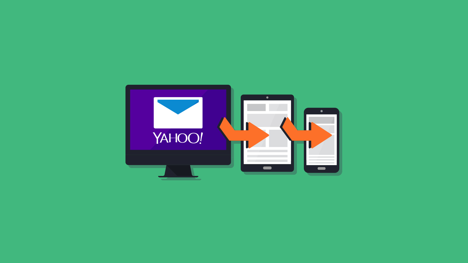
Yahoo! Mail Now Supports Media Queries
Kudos to Justin Khoo at FreshInbox for starting the petition for Yahoo! to change their parser to support media queries. It seems we’ll need to revise our previous post, 9 Ways to Prevent Yahoo! Headaches, and that the fix described in Stop Yahoo! Mail from Rendering Your Media Queries is no longer needed.
Though Yahoo! has remedied the media queries issue, it looks like attribute selectors are still not supported. Is another petition in the works? Maybe. But for now, we’ll break down the changes and what they mean for you.
The Good News
Supporting media queries is nice, but let’s face it, it isn’t terribly exciting for most email developers. In fact, the browser window has to be quite narrow to render media queries to trigger on most devices. Just to be clear, though, with this Yahoo! fix, you no longer need to include attribute selectors in your media queries when designing emails for any client.
Are There Any Exceptions?
Absolutely. We’re still talking about email design, right? The media features max-device-width, min-device-width and webkit-min-device-pixel-ratio are not supported in Yahoo! Mail. And Yahoo! Mail also does not support queries with more than one media feature.
For example, the following media queries are not supported:
                                @media only screen and (max-device-width: 2000px) { .. }
@media only screen and (min-device-width: 2000px) { .. }
@media only screen and (webkit-min-device-pixel-ratio: 2000px) { .. }
@media only screen and (max-width: 2000px) and (min-width: 1px)  { .. }
Targeting Yahoo! Mail with Media Queries
Mark Robbins of GoRebelMail noticed that you can use a special media query to target only Yahoo! Mail.
He tweeted:
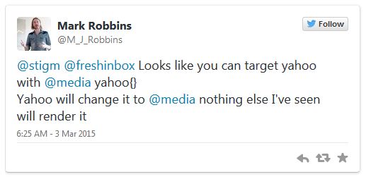
It’s simple; just use the mediatype “yahoo” in your query.
@media screen yahoo { .. }
In Mark’s testing, and in ours here at EOA, we have yet to find another client that is rendering these styles. So if you have a style that needs to be added just for Yahoo! Mail, here is your work around. Note: An earlier version of the hack did not work on IE10 and IE11 because the screen mediatype was missing.
The Bad News
Though Yahoo! has fixed the media queries conundrum, they have mostly not changed how their parser handles attribute selectors. Most are still ignored by the parser. The only attribute selector that we have observed working in Yahoo! Mail (thanks again Justin Khoo!) is the element[class=XXX] selector. For example:
div[class="classname"]
Does this mean you need to go back through all of your templates and remove the attribute selectors? Probably not. Due to the wider screen size of most desktops, most media queries wouldn’t have triggered on Yahoo! Mail anyway.
If you do want to see responsive behavior in this client, you should go in and remove the attribute selectors. You can use this lack of support to your advantage, too, if you’d like to include styles that Yahoo! Mail will ignore.
Test and Test Again
We applaud Yahoo! for listening to their customers and fixing their parser. Now if we could get Gmail to do the same…
Want to make sure all of your templates are looking good in Yahoo! Mail or any other email client? No problem! Sign up for our 7 day free trial and test your heart out.