Industry News
Yahoo! Mail Now Supports Media Queries

Industry News

Kudos to Justin Khoo at FreshInbox for starting the petition for Yahoo! to change their parser to support media queries. It seems we’ll need to revise our previous post, 9 Ways to Prevent Yahoo! Headaches, and that the fix described in Stop Yahoo! Mail from Rendering Your Media Queries is no longer needed.
Though Yahoo! has remedied the media queries issue, it looks like attribute selectors are still not supported. Is another petition in the works? Maybe. But for now, we’ll break down the changes and what they mean for you.
Supporting media queries is nice, but let’s face it, it isn’t terribly exciting for most email developers. In fact, the browser window has to be quite narrow to render media queries to trigger on most devices. Just to be clear, though, with this Yahoo! fix, you no longer need to include attribute selectors in your media queries when designing emails for any client.
Absolutely. We’re still talking about email design, right? The media features max-device-width, min-device-width and webkit-min-device-pixel-ratio are not supported in Yahoo! Mail. And Yahoo! Mail also does not support queries with more than one media feature.
For example, the following media queries are not supported:
                                @media only screen and (max-device-width: 2000px) { .. }
@media only screen and (min-device-width: 2000px) { .. }
@media only screen and (webkit-min-device-pixel-ratio: 2000px) { .. }
@media only screen and (max-width: 2000px) and (min-width: 1px)  { .. }
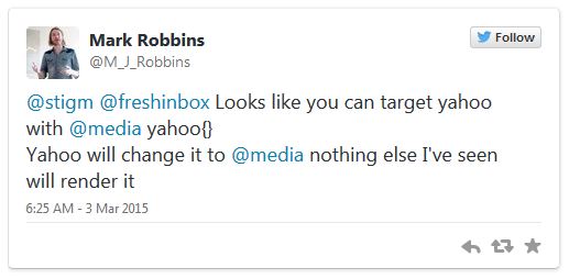
Mark Robbins of GoRebelMail noticed that you can use a special media query to target only Yahoo! Mail.
He tweeted:

It’s simple; just use the mediatype “yahoo” in your query.
@media screen yahoo { .. }
In Mark’s testing, and in ours here at EOA, we have yet to find another client that is rendering these styles. So if you have a style that needs to be added just for Yahoo! Mail, here is your work around. Note: An earlier version of the hack did not work on IE10 and IE11 because the screen mediatype was missing.
Though Yahoo! has fixed the media queries conundrum, they have mostly not changed how their parser handles attribute selectors. Most are still ignored by the parser. The only attribute selector that we have observed working in Yahoo! Mail (thanks again Justin Khoo!) is the element[class=XXX] selector. For example:
div[class="classname"]
Does this mean you need to go back through all of your templates and remove the attribute selectors? Probably not. Due to the wider screen size of most desktops, most media queries wouldn’t have triggered on Yahoo! Mail anyway.
If you do want to see responsive behavior in this client, you should go in and remove the attribute selectors. You can use this lack of support to your advantage, too, if you’d like to include styles that Yahoo! Mail will ignore.
We applaud Yahoo! for listening to their customers and fixing their parser. Now if we could get Gmail to do the same…
Want to make sure all of your templates are looking good in Yahoo! Mail or any other email client? No problem! Sign up for our 7 day free trial and test your heart out.
Stop switching back and forth between platforms during pre-deployment and QA. With Sinch Email on Acid you can find and fix problems all in one place. Double check everything from content to accessibility and deliverability. Plus, with accurate Email Previews on more than 100 of the most popular clients and devices, you can confidently deliver email perfection every time.
Author: Kyle Lapaglia
When you visit any website, it may store or retrieve information on your browser, mostly in the form of cookies. This information might be about you, your preferences or your device and is mostly used to make the site work as you expect it to. The information does not usually directly identify you, but it can give you a more personalized web experience. Because we respect your right to privacy, you can choose not to allow some types of cookies. Click on the different category headings to find out more and change our default settings. However, blocking some types of cookies may impact your experience of the site and the services we are able to offer.
Cookie Statement
These cookies are necessary for the website to function and cannot be switched off in our systems. They are usually only set in response to actions made by you which amount to a request for services, such as setting your privacy preferences, logging in or filling in forms. You can set your browser to block or alert you about these cookies, but some parts of the site will not then work.
These cookies do not store any personally identifiable information.
Cookie details
| Cookie Subgroup | Cookies | Cookies used |
|---|---|---|
| eu5.mm.sdi.sinch.com | ASP.NET_SessionId | First Party |
| community.sinch.com | AWSALB , LiSESSIONID | First Party |
| appengage.sinch.com | dd_cookie_test_ | First Party |
| tickets.sinch.com | atlassian.xsrf.token , JSESSIONID | First Party |
| cockpit2.sinch.com | SESSION | First Party |
| engage.sinch.com | instapage-variant-xxxxxxxx | First Party |
| dashboard.sinch.com | cookietest | First Party |
| brand.sinch.com | PHPSESSID , AWSALBCORS | First Party |
| sinch.com | __cf_bm , OptanonConsent , TEST_AMCV_COOKIE_WRITE , OptanonAlertBoxClosed , onesaasCookieSettings, QueryString, functional-cookies, performance-cookies, targeting-cookies, social-cookies lastExternalReferrer, lastExternalReferrertime, cookies, receive-cookie-deprecation _gdvisitor, _gd_session, _gcl_au, _fbp, _an_uid, _utm_zzses, lpv | First Party |
| mediabrief.com | __cf_bm | Third Party |
| recaptcha.net | _GRECAPTCHA | Third Party |
| cision.com | __cf_bm | Third Party |
| techtarget.com | __cf_bm | Third Party |
These cookies allow us to count visits and traffic sources so we can measure and improve the performance of our site. They help us to know which pages are the most and least popular and see how visitors move around the site. All information these cookies collect is aggregated and therefore anonymous.
If you do not allow these cookies we will not know when you have visited our site, and will not be able to monitor its performance.
Cookie details
| Cookie Subgroup | Cookies | Cookies used |
|---|---|---|
| community.sinch.com | ValueSurveyVisitorCount | First Party |
| buzz.sinch.com | instap-spid.8069 , instap-spses.8069 | First Party |
| appengage.sinch.com | _dd_s | First Party |
| sinch.com | AMP_TLDTEST , rl_page_init_referrer , rl_trait , _vis_opt_s , __q_state_dp56h9oqwhna9CoL , cb_user_id , __hstc , rl_anonymous_id , rl_user_id , initialTrafficSource , _vwo_uuid , _vwo_uuid_v2 , rl_page_init_referring_domain , _hjIncludedInSessionSample_xxx , apt.uid , __hssrc , test_rudder_cookie , cb%3Atest , __hssc , rl_group_trait , _hjAbsoluteSessionInProgress , _vwo_referrer , _vwo_sn , _vis_opt_test_cookie , _hjFirstSeen , _hjTLDTest , _hjSession_xxxxxx , s_sq , _vwo_ds , rl_group_id , _vis_opt_exp_n_combi , s_cc , _gclxxxx , cb_anonymous_id , cb_group_id , apt.sid , rl_session , _uetvid , AMP_899c7e29a9 , _hjSessionUser_xxxxxx | First Party |
| brand.sinch.com | AMP_TEST | First Party |
| engage.sinch.com | no-cache , instap-spses.85bb , instap-spid.85bb | First Party |
| www.sinch.com | d-a8e6 , s-9da4 | First Party |
| nr-data.net | JSESSIONID | Third Party |
| sinch-en.newsroom.cision.com | _ga, _gid | Third Party |
| sinch.in | _ga_xxxxxxxxxx, _gat_UA-XXXXXX-X, _gid, _ga | Third Party |
| g.fastcdn.co | instap-spses.85bb | Third Party |
| hello.learn.mailjet.com | pardot, visitor_id, visitor_id##### | Third Party |
| www.googletagmanager.com | userId | Third Party |
| hello.learn.mailgun.com | visitor_id#####, visitor_id | Third Party |
| dev.visualwebsiteoptimizer.com | _vwo_ssm | Third Party |
| box.com | box_visitor_id | Third Party |
| app.box.com | z, cn | Third Party |
| sinch-tfn.paperform.co | laravel_session | Third Party |
| go.sinch.in | visitor_id#####, visitor_id | Third Party |
| Qualified | __q_local_form_debug | Third party |
| Rudderstack | rudder.inProgress, rudder.3156dd1f-7029-4600-ae54-baf147d9af20.queue, rudder.3156dd1f-7029-4600-ae54-baf147d9af20.ack, rudder.3156dd1f-7029-4600-ae54-baf147d9af20.reclaimStart, rudder.3156dd1f-7029-4600-ae54-baf147d9af20.reclaimEnd, | Third party |
| 6sense | _6senseCompanyDetauls, _6signalTTL | Third party |
| Appcues | apc_local_id, apc_user | Third party |
These cookies may be set through our site by our advertising partners. They may be used by those companies to build a profile of your interests and show you relevant adverts on other sites. They do not store directly personal information, but are based on uniquely identifying your browser and internet device.
If you do not allow these cookies, you will experience less targeted advertising.
Cookie details
| Cookie Subgroup | Cookies | Cookies used |
|---|---|---|
| investors.sinch.com | visitor_id | First Party |
| community.sinch.com | VISITOR_BEACON , LithiumVisitor | First Party |
| sinch.com | _uetsid , ajs_user_id , _gcl_aw , ajs_group_id , AMCV_ , __utmzzses , _fbp , _gcl_au , AMCVS_ | First Party |
| go.latam.sinch.com | visitor_id##### , pardot | First Party |
| linkedin.com | li_gc, bcookie, lidc, AnalyticsSyncHistory, UserMatchHistory, li_sugr | Third Party |
| pi.pardot.com | lpv151751, pardot | Third Party |
| hsforms.com | _cfuvid | Third Party |
| google.com | CONSENT | Third Party |
| sinch.in | _gclxxxx, _gcl_au | Third Party |
| www.linkedin.com | bscookie | Third Party |
| bing.com | MUID, MSPTC | Third Party |
| www.facebook.com | Third Party | |
| hello.learn.mailgun.com | pardot | Third Party |
| www.youtube.com | TESTCOOKIESENABLED | Third Party |
| dev.visualwebsiteoptimizer.com | uuid | Third Party |
| g2crowd.com | __cf_bm | Third Party |
| pardot.com | visitor_id#####, visitor_id | Third Party |
| tracking.g2crowd.com | _session_id | Third Party |
| hubspot.com | __cf_bm, _cfuvid | Third Party |
| doubleclick.net | test_cookie, IDE | Third Party |
| youtube.com | CONSENT, VISITOR_PRIVACY_METADATA, VISITOR_INFO1_LIVE | Third Party |
| go.sinch.in | pardot | Third Party |
| liadm.com | lidid | Third Party |
| www.google.com | _GRECAPTCHA | Third Party |
These cookies enable the website to provide enhanced functionality and personalisation. They may be set by us or by third party providers whose services we have added to our pages. If you do not allow these cookies, then some or all of these services may not function properly.
Cookie details
| Cookie Subgroup | Cookies | Cookies used |
|---|---|---|
| portal.sinch.com | pnctest | First Party |
| partner.appengage.sinch.com | _dd_s | First Party |
| investors.sinch.com | First Party | |
| community.sinch.com | LithiumUserInfo , LithiumUserSecure | First Party |
| tickets.sinch.com | selectedidp | First Party |
| engage.sinch.com | ln_or | First Party |
| cockpit2.sinch.com | CSRF-TOKEN , NG_TRANSLATE_LANG_KEY | First Party |
| sinch.com | apt.temp-xxxxxxxxxxxxxxxxxx , hubspotutk , ajs%3Acookies , cf_clearance , ajs%3Atest , __tld__ , __q_domainTest , pfjs%3Acookies , ajs_anonymous_id | First Party |
| auth.appengage.sinch.com | AUTH_SESSION_ID , KEYCLOAK_3P_COOKIE , KEYCLOAK_3P_COOKIE_SAMESITE , KC_RESTART , AUTH_SESSION_ID_LEGACY | First Party |
| www.recaptcha.net | _GRECAPTCHA | Third Party |
| boxcdn.net | __cf_bm | Third Party |
| d2oeshgsx64tgz.cloudfront.net | cookietest | Third Party |
| sinch-np.paperform.co | XSRF-TOKEN, laravel_session | Third Party |
| vimeo.com | __cf_bm, vuid | Third Party |
| sinch-ca-sc.paperform.co | XSRF-TOKEN, laravel_session | Third Party |
| box.com | site_preference | Third Party |
| app.box.com | bv | Third Party |
| sinch-tfn.paperform.co | XSRF-TOKEN | Third Party |
| cision.com | cf_clearance | Third Party |
These cookies are set by a range of social media services that we have added to the site to enable you to share our content with your friends and networks. They are capable of tracking your browser across other sites and building up a profile of your interests. This may impact the content and messages you see on other websites you visit. If you do not allow these cookies you may not be able to use or see these sharing tools.
Cookie details
| Cookie Subgroup | Cookies | Cookies used |
|---|---|---|
| community.sinch.com | ln_or | First Party |
| sinch.in | _fbp | Third Party |
| youtube-nocookie.com | CONSENT | Third Party |
| youtube.com | YSC | Third Party |