Industry News
10 Killer Email Marketing Infographics

Industry News
In the age of “infobesity,” we are bombarded by information at every turn. With this constant stream of informational chatter buzzing around us, we don’t have the time to sit down and read every article. Infographics are more popular than ever because they serve up information on a visually rich platter. According to Graphs.net, the search volume for infographics increased by a whopping 800% between 2010 and 2012. Platforms like Pinterest and Instagram have risen in popularity due to the public desire for infographics and other image-based content. Because infographics are visually stimulating and compelling, the reader is more likely to engage. That’s why we searched high and low on the web and found the best email marketing infographics to share with you. So it’s time for you to take a quick break from your day and soak up some visually enticing information.
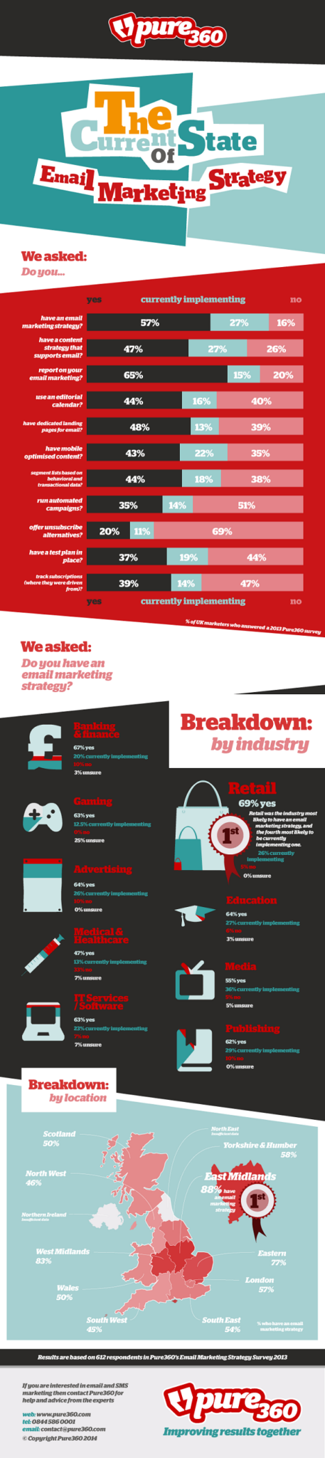
Pure360 surveyed over 600 respondents to get the lay of the land for the current state of email marketing. Their survey not only breaks down the usage of email best practices, like tracking email analytics and leveraging autoresponders, but it also gives further insight into email marketing popularity by industry and geographic location. Retail comes in at #1 with a whopping 69% with an email marketing strategy, while the healthcare industry took last place at 47%. Check out the rest of the data and see if your company stacks up to the stats below.
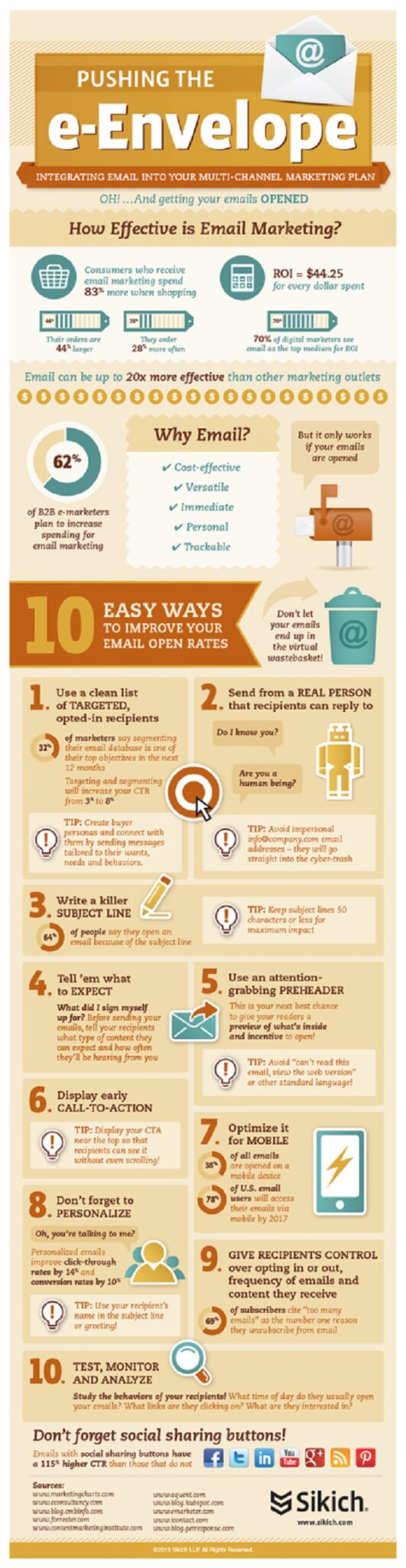
Opens are the ‘top funnel’ of email metrics. We call it the ‘top funnel’ because open rates have a domino effect on the rest of your email metrics. If no one opens your email, all your other metrics (like CTR) will suffer. Sikich created this stellar infographic that will pack your arsenal full of tips and tricks to optimize your open rates. Check ’em out below. If you’re still on the prowl for some more awesome killer open rate strategies, check out our blog here.
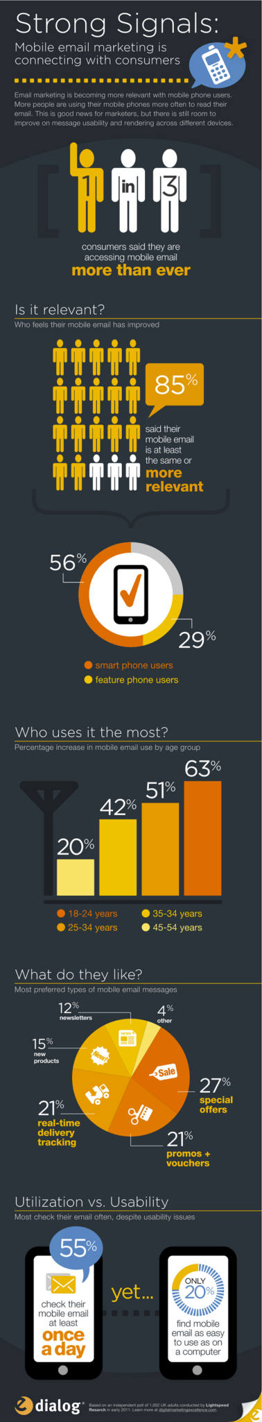
Not only is mobile here to stay, it is exponentially growing in popularity. eDialog gathered oodles of statistics surrounding mobile usage for email today and the results are astounding. They surveyed over 1,000 people and one of the amazing stats eDialog gathered was that 55% of people check their mobile email at least once a day. They also uncovered numbers surrounding what age group uses mobile the most, how relevant mobile is today, and what type of mobile email messages people prefer. Check out their discoveries below.
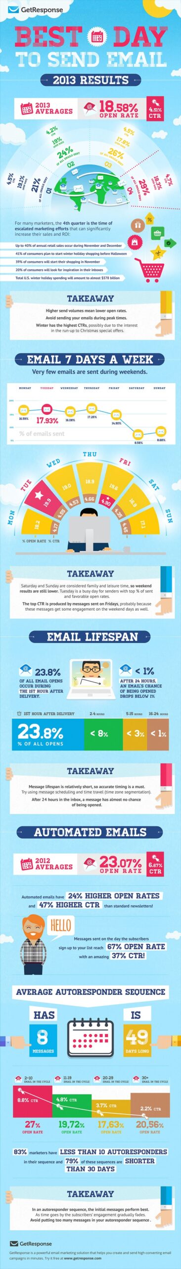
After the effort you put into designing, writing and editing your email campaign, it’s easy to feel trigger happy with the send button. However, you should get your finger off that trigger and consider when the most optimal day to send is. GetResponse took an in-depth look into the 7 days of the week so you can tap into the “sweet spot” when sending. Not only did they look at email performance regarding opens on Monday-Sunday, they also documented other important factors like the lifespan of an email. Find out when you really should be queuing up email for your audience.
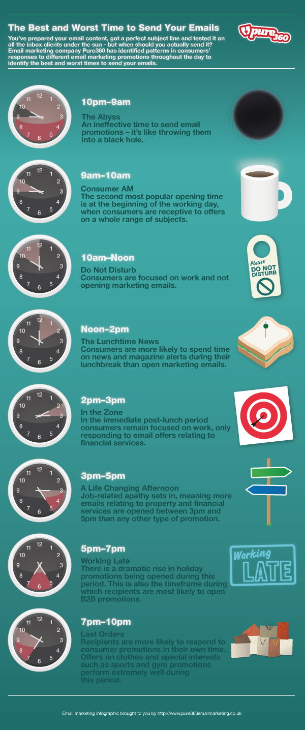
Now that you know the optimal day to send your email from the graph above, find out when the best time of day is to deploy your email. Pure360 breaks down patterns in consumers’ responses to email marketing messages throughout a given day. Check out their daily break-downs below to uncover the best and worst times to send your emails.
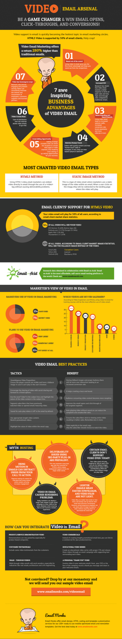
If you haven’t tried incorporating video in your email marketing efforts, now is the time. Only 25% of email marketers are using it currently, so as an early adopter you can stand out from the crowd. HTML5 video has better support than ever, especially for iOS users who will be able to play your video immediately on their device. This can result in massively increased engagement and a 280% higher return than traditional email marketing! We worked with the Email Monks to create this awesome infographic. But don’t let me spoil all the stats for you, check it out for yourself.
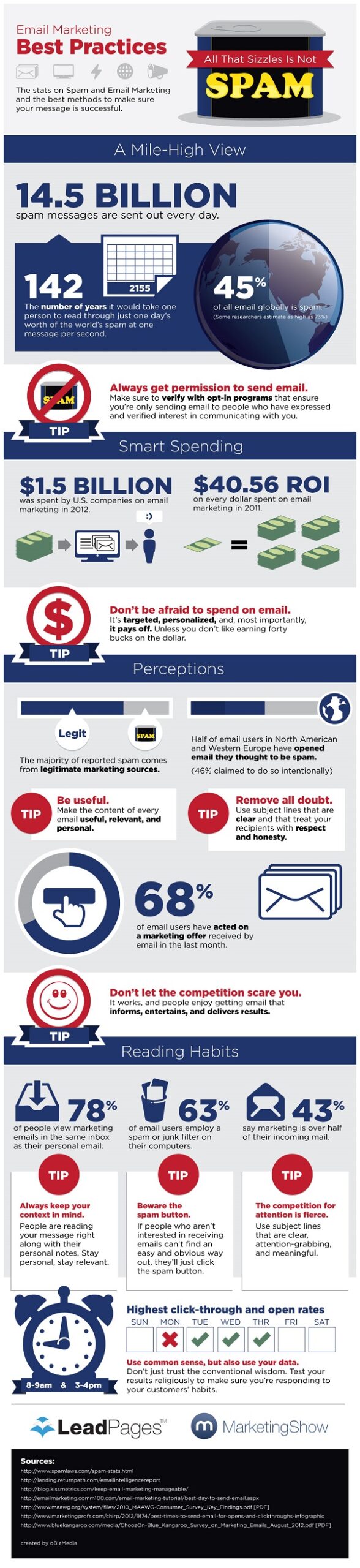
If you don’t make it to the inbox, you won’t be getting ANY opens. Period. Before you can worry about your campaign’s open rate, CTR or unsubscribe rate, you need to focus on deliverability. LeadPages breaks down critical statistics regarding SPAM so you can save the integrity of your email reputation and make sure your message is getting across loud and clear.
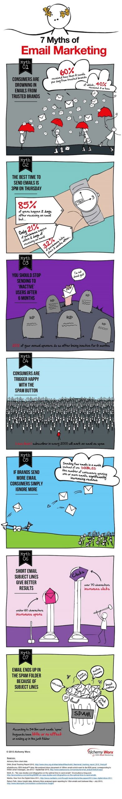
Napoleon Bonaparte said it best when he stated, “War is ninety percent information.” As digital marketers, we can no longer rely on JUST our intuition when deciding what will resonate with our audience. We need hard facts in order to get our message across. So before you make any decisions, make sure you have facts to support your strategy. Even more than that, make sure these are real facts based off of analytics and not myths circulating around the email marketing realm. AlchemyWorx took the time to debunk 7 popular email marketing myths. Discover what is fact and what is fiction below.
Every email marketer can relate to that rush of anxiety you feel when you are about to send out a campaign. Questions like these run through your head:
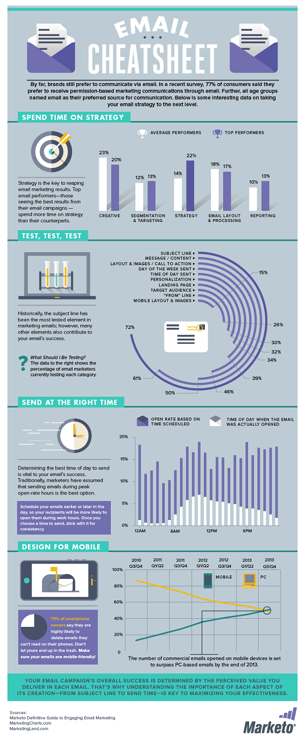
Those questions dart through your worried mind at such a frantic pace that it’s hard to make sure you have crossed all your T’s and dotted your I’s. Grab Marketo’s email “cheat sheet” to alleviate your anxiety the next time you deploy. Ensure your campaigns are flawless, every time.
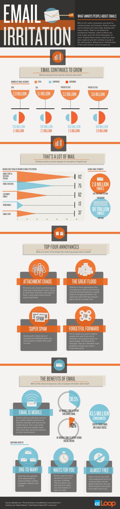
As your subscribers’ inboxes fills with mail, they become more and more trigger happy. Soon, they’re jamming the unsubscribe button without a second thought. That is why you must find a good balance of getting in front of your reader, but not overwhelming or annoying them. That is definitely a fine line to walk. Luckily CCLoop compiled the top things that annoy people about email. Take a good look at this infographic to ensure you aren’t making one of these deadly email mistakes.
In our world of constant tweets, texts, updates and blogs, infographics deliver information in a refreshingly direct manner. Not only do they please the eye, but they spotlight the most important and compelling parts of a story in a way that’s truly engaging. Mix up your content strategy today and create some visually appealing infographics to draw your readers in.
What kind of infographics inspire you? Share them below!