Let it Snow: How to Use CSS Animations in Holiday Emails
The holidays and little surprises go together like hot cocoa and marshmallows. Looking for a way to add a little extra joy to your holiday email campaigns? We've got the perfect inbox stocking-stuffer.
It's been five years since our friend Jay Oram of ActionRocket showed us how to create animated falling snowflakes in an HTML email. We took out our snow shovels to dig it up again so you can enhance emails and surprise your subscribers with some holiday magic.
Table of content
-
01
How an animated snowflake effect looks in email -
02
Email client support for CSS animations -
03
Setting up the snowflake CSS animation - Creating your snowflakes
- Animating your snowflakes
-
04
HTML for the snowflake animation -
05
Other ways to use this CSS animation in emails -
06
Take your emails to the next level...
How an animated snowflake effect looks in email
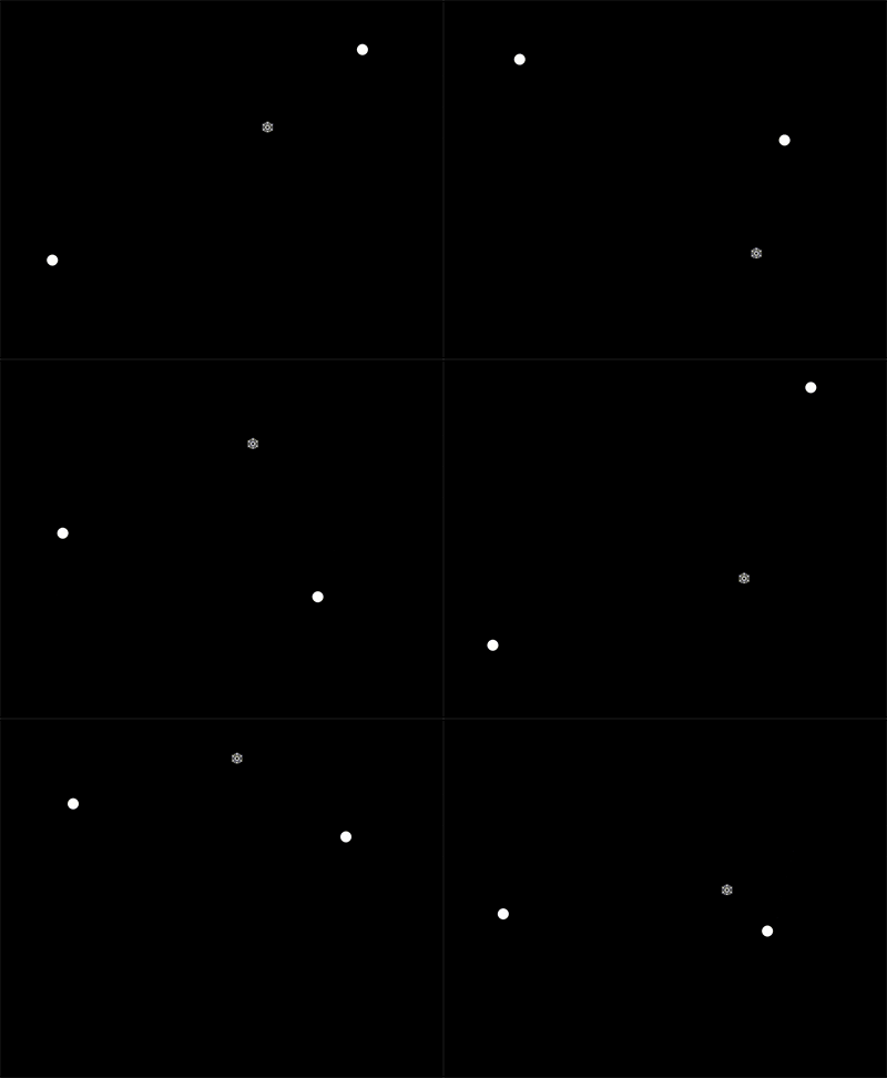
Take a look at the email newsletter Jay coded up for us back in the day. We're willing to bet most of the emails you opened over Black Friday and Cyber Monday did not include little snowflakes gently falling down your screen.

This isn't the sort of thing you expect to see in a typical newsletter or email promotion. But here's the thing... Once you've shattered your subscribers' expectations, you've set the stage for even more inbox surprises.
That could very well mean higher open rates and increased email engagement. Now you're subscribers will be wondering what they might find the next time they check out your email marketing campaigns.
You know how a gift always looks better with a bow on top? Think of this
Email client support for CSS animations
Unfortunately, nothing in email development is perfect. This technique uses CSS animation and keyframes. According to CanIEmail.com, these are only supported in clients using WebKit as the rendering engine, which is mainly Apple Mail and Outlook for Mac as well as Samsung and Thunderbird.
But if you check out your email analytics, that could be significant portion of your email subscribers. You'll find out how to target clients that support CSS animations
Standing out in the inbox is a never-ending challenge. Putting in a little extra effort in this way makes your emails memorable. But enough with the fluff. Let's turn things over to Jay Oram and find out how to let it snow. Here's his animated snowflake tutorial for email developers looking to spread holiday cheer.
Setting up the snowflake CSS animation
The snow effect is essentially a snowflake or shape in a div that you animate using CSS. This technique moves the image from the top to the bottom of a container div you place around your email tables.
CSS animations work on a range of email clients including iOS, Apple Mail, Android Native Mail and Outlook for Mac. The snow animation won’t display on other email clients, so you don’t need to provide a fallback.
First, we set up the media query to detect the webkit, that will support the CSS animation.
@media screen and (-webkit-min-device-pixel-ratio: 0) {
}
Next, we set up the container the snow will be in.
.snowcontainer{
  position:relative;
  width:100%;
  overflow:visible;
}
Creating your snowflakes
We then need to define the snow. The simplest way to do this is to use a shape that doesn’t need an image, such as a square. You can create a square by setting height: 18px by width: 18px and setting a border-radius that is half the height (to gain a perfect circle), border-radius: 9px. Set the position:absolute so the snow will be positioned within the container and top: -20px to start the animation before it enters the snowcontainer. Finally, add a background-color to set the color of the shape.
It looks like this:

Here's the code for the shape snowflake:
.snow{
            height: 18px;
            border-radius: 9px;
            width: 18px;
            position: absolute;
            top: -20px;
            background-color: #ffffff;
      }
Another way to add a snowflake is to add a background image. This technique is similar to to the square technique above, but it uses a background-image and no border-radius. With these changes, the snowflake will appear like this:

Here’s the code for the image snowflake:
.snowimage{
  /* size of image */
  height:18px;
  width:18px;
  /* absolute - relative to the container div */
  position:absolute;
  /* Where animation starts */
  top:-20px;
  /* image link */
  background-image:url('images/snowflake.png');
}
Setting the background-image as a .png means the snowflake will have a transparent background and show the content through it. If you need some snowflake inspiration, check out the Noun Project’s snowflake icons.
Animating your snowflakes
With the code as is, we just have some shapes within a <div>. To animate them, we can put together a shortened version of an animation. See below:
.snow1{
  animation: snow1 5s linear 0s infinite;
 }
 /* animation: Name of animation / length of animation / timing function
(linear = same speed from beginning to end) / delay (time between
animation end and start) / number of times */
This animation is called snow1. We define the length of the animation as 5s (five seconds) and the linear timing function. The linear timing number keeps the animation the same speed throughout – 0s (zero seconds) is the delay before the animation starts again. Finally, we include the number of times the animation will run (infinite).
By creating a few different animations with slightly different lengths and delay time, the snow will fall at random.
.snow2{
  animation: snow2 6s linear 1s infinite;
 }
 .snow3{
  animation: snow3 7s linear 2s infinite;
 }
Next, we set up the keyframe animations to dictate where the snowflake will move to and from.
@keyframes snow1
 {
  0% { top:0%;left:50%; }
  100% { top:100%;left:65%; }
 }
At the start of the animation (0%), we position the snowflake at the top of the div (0%) and 50% from the left. At the end of the animation (100%) the snowflake is 100% from the top and 65% from the left.
By setting the start and end points slightly different in each animation, the snow will seem to appear more at random.
@keyframes snow2
 {
  0% { top:0%;left:30%; }
  100% { top:100%;left:25%; }
 }
 @keyframes snow3
 {
  0% { top:0%;left:70%; }
  100% { top:100%;left:60%; }
 }

HTML for the snowflake animation
Once you’ve created the CSS animation, you’ll need to add this effect to your email using HTML. To create this animation technique, the first bit of HTML you need is a <div> to open the snow container. You can set the height and width of the container to establish where the snow will show. For example:
<div class="snowcontainer" style="width: 100%; height: 500px;">
Next, each individual snowdrop needs to be set. To do this, start with a <div> with the class of the snowimage or snow as set up in your CSS. Follow that with the name of the animation (e.g. snow1). The code should look like this:
<div class="snowimage snow1"></div>
Then, add in all the snowdrops and animations within the snow container. See below:
<div class="snowcontainer" style="height: 500px;">
  <div class="snowimage snow1"></div>
  <div class="snow snow2"></div>
  <div class="snow snow3"></div>
Place all your email content you would like below your snowdrops and finish with a closing </div> to end the snowcontainer.
Get all the code and see it in action from Jay Oram on CodePen.
Other ways to use this CSS animation in emails
Thanks again to Jay Oram of ActionRocket for the tutorial and code snippets above.
Christmas only comes once a year, but you can use this CSS animation all year long if you put your creativity cap on. Here are a few ideas to get you started:
- Autumn leaves for fall themed emails. This could be a way to have fun with back-to-school email marketing.
- Colorful falling confetti to celebrate just about anything, including birthdays, anniversaries, and other milestone emails.
- Matrix-style raining code could be a memorable way to enhance emails to a tech-savvy audience.
It can also be raining cats and dogs, or raining men (hallelujah), or turkeys or frogs could be falling out of the sky. Heck... you can drop tons of little poop emojis in emails if that's your thing.
Take your emails to the next level...
Of course, this is the kind of things that stops being surprising and could easily start to get annoying if you over use it. So, if you want some other ideas for creating engaging emails, check out these classic episodes of Notes from the Dev: Video Edition with Megan Boshuyzen.
Rollover images are a simple yet impactful way to add interactivity into email. Nout Boctor-Smith shows you how to pull it off.
For more advanced interactivity, Emre Demirel showed us how he gamified an email with a rock, paper, scissors you can play in the inbox.
Jay Oram brought us even more inbox fun with a Wordle game for email. And you can follow along as Megan Boshuyzen explains how she coded her award-winning interactive email for Email Camp: Road Trip Edition.


